Quantcast
Channel: Search Results for “sql”– R-bloggers
Viewing all 482 articles
Browse latest View live

Launch Apache Spark on AWS EC2 and Initialize SparkR Using RStudio

$
0
0

(This article was first published on Emaasit's Blog » R, and kindly contributed to R-bloggers)

This post was first published on SparkIQ Labs’ blog and re-posted on my personal blog.

Introduction

sparkr-ec2

In this blog post, we shall learn how to launch a Spark stand alone cluster on Amazon Web Services (AWS) Elastic Compute Cloud (EC2) for analysis of Big Data. This is a continuation from our previous blog, which showed us how to download Apache Spark and start SparkR locally on windows OS and RStudio.

We shall use Spark 1.5.1 (released on October 02, 2015) which has a spark-ec2 script that is used to install stand alone Spark on AWS EC2.  A nice feature about this spark-ec2 script is that it installs RStudio server as well. This means that you don’t need to install RStudio server separately. Thus you can start working with your data immediately after Spark is installed.


Prerequisites

  • You should have already downloaded Apache Spark onto your local desktop from the official site. You can find instructions on how to do so in our previous post.
  • You should have an AWS account, created secret access key(s) and downloaded your private key pair as a .pem file. Find instructions on how to create your access keys here and to download your private keys here.
  • We will launch the clusters through Bash shell on Linux. If you are using Windows OS I recommend that you install and use the Cygwin terminal (It provides functionality similar to a Linux distribution on Windows)

Launching Apache Spark on AWS EC2

We shall use the spark-ec2 script, located in Spark’s ec2 directory to launch, manage and shutdown Spark clusters on Amazon EC2. It will setup Spark, HDFS, Tachyon, RStudio on your cluster.

Step 1: Go into the ec2 directory

Change directory into the “ec2″ directory. In my case, I downloaded Spark onto my desktop, so I ran this command.

$ cd Desktop/Apache/spark-1.5.1/ec2

1-cd

Step 2: Set environment variables

Set the environment variables AWS_ACCESS_KEY_ID and AWS_SECRET_ACCESS_KEY to your Amazon EC2 access key ID and secret access key.

$ export AWS_SECRET_ACCESS_KEY=AaBbCcDdEeFGgHhIiJjKkLlMmNnOoPpQqRrSsTtU

$ export AWS_ACCESS_KEY_ID=ABCDEFG1234567890123

Step 3: Launch the spark-ec2 script

Launch the cluster by running the following command.

$ ./spark-ec2 --key-pair=awskey --identity-file=awskey.pem --region=us-east-1 --instance-type=c3.4xlarge -s 2 --copy-aws-credentials launch test-cluster 

2-launch

Where;

  • –key-pair=<name_of_your_key_pair> , The name of your EC2 key pair
  • –identity-file=<name_of_your_key_pair>.pem , The private key file
  • –region=<the_region_where_key_pair_was_created>
  • –instance-type=<the_instance_you_want>
  • -s N, where N is the number of slave nodes
  • “test-cluster” is the name of the cluster

In case you want to set other options for the launch of your cluster, further instructions can be found on the Spark documentation website.

As I mentioned earlier, this script also installs RStudio server, as can be seen in the figure below.

3-install-rstudio

The cluster installation takes about 7 minutes. When it is done, the host address of the master node is displayed at the end of the log message as shown in the figure below. At this point your Spark cluster has been installed successfully and you are a ready to start exploring and analyzing your data.

4-done

Before you continue, you may be curious to see whether your cluster is actually up and running. Simply log into your AWS account and go to the EC2 dashboard. In my case, I have 1 master node and 2 slave/worker nodes in my Spark cluster.

2-launch-awsScreen

Use the address displayed at the end of the launch message and access the Spark User Interface (UI) on port 8080. You can also get the host address of your master node by using the “get-master” option in the command below.

$ ./spark-ec2 --key-pair=awskey --identity-file=awskey.pem get-master test-cluster

5-online

Step 4: Login to your cluster

In the terminal you can login to your master node by using the “login” option in the following command

$ ./spark-ec2 --key-pair=awskey --identity-file=awskey.pem login test-cluster

6-login

Step 5 (Optional): Start the SparkR REPL

Here you can actually start the SparkR REPL by typing the following command.

$ spark/bin/sparkR

7-start-sparkr

SparkR will be initialized and you should see a welcome message as shown in the Figure below. Here you can actually start working with your data. However most R users, like myself, would like to work in an Integrated Development Environment (IDE) like RStudio. See steps 6 and 7 on how to do so.

8-welcome-sparkr

Step 6: Create user accounts

Use the following command to list all available users on the cluster.

$ cut -d: -f1 /etc/passwd

9-users

You will notice that “rstudio” is one of the available user accounts. You can create other user accounts and passwords for them using these commands.

$ sudo adduser daniel

$ passwd daniel

In my case, I used the “rstudio” user account and changed its password.

10-create-passwd

Initializing SparkR Using RStudio

The spark-ec2 script also created a “startSpark.R” script that we shall use to initialize SparkR.

Step 7: Login to RStudio server

Using the username you selected/created and the password you created, login into RStudio server.

11-rstudio

Step 8: Initialize SparkR

When you log in to RStudio server, you will see the “startSpark.R” in your files pane (already created for you).

12-startSparkR

Simply run the “startSpark.R” script to initialize SparkR. This creates a Spark Context and a SQL Context for you.

13-initialize

Step 9: Start Working with your Data

Now you are ready to start working with your data.

Here I use a simple example of the “mtcars” dataset to show that you can now run SparkR commands and use the MLLib library to run a simple linear regression model.

14-lm-example

You can view the status of your jobs by using the host address of your master and listening on port 4040. This UI also displays a chain of RDD dependencies organized in Direct Acyclic Graph (DAG) as shown in the figure below.

15-DAG

Final Remarks

The objective of this blog post was to show you how to get started with Spark on AWS EC2 and initialize SparkR using RStudio. In the next blog post we shall look into working with actual “Big” datasets stored in different data stores such as Amazon S3 or MongoDB.

Further Interests: RStudio Shiny + SparkR

I am curious about how to use Shiny with SparkR and in the next couple of days I will investigate this idea further. The question is: how can one use SparkR to power shiny applications. If you have any thoughts please share them in the comments section below and let’s discuss.

To leave a comment for the author, please follow the link and comment on their blog: Emaasit's Blog » R.

R-bloggers.com offers daily e-mail updates about R news and tutorials on topics such as: Data science, Big Data, R jobs, visualization (ggplot2, Boxplots, maps, animation), programming (RStudio, Sweave, LaTeX, SQL, Eclipse, git, hadoop, Web Scraping) statistics (regression, PCA, time series, trading) and more...

Launch Apache Spark on AWS EC2 and Initialize SparkR Using RStudio

$
0
0

(This article was first published on SparkIQ Labs Blog » R, and kindly contributed to R-bloggers)

sparkr-ec2

Introduction

In this blog post, we shall learn how to launch a Spark stand alone cluster on Amazon Web Services (AWS) Elastic Compute Cloud (EC2) for analysis of Big Data. This is a continuation from our previous blog, which showed us how to download Apache Spark and start SparkR locally on windows OS and RStudio.

We shall use Spark 1.5.1 (released on October 02, 2015) which has a spark-ec2 script that is used to install stand alone Spark on AWS EC2.  A nice feature about this spark-ec2 script is that it installs RStudio server as well. This means that you don’t need to install RStudio server separately. Thus you can start working with your data immediately after Spark is installed.

Prerequisites

  • You should have already downloaded Apache Spark onto your local desktop from the official site. You can find instructions on how to do so in our previous post.
  • You should have an AWS account, created secret access key(s) and downloaded your private key pair as a .pem file. Find instructions on how to create your access keys here and to download your private keys here.
  • We will launch the clusters through Bash shell on Linux. If you are using Windows OS I recommend that you install and use the Cygwin terminal (It provides functionality similar to a Linux distribution on Windows)

Launching Apache Spark on AWS EC2

We shall use the spark-ec2 script, located in Spark’s ec2 directory to launch, manage and shutdown Spark clusters on Amazon EC2. It will setup Spark, HDFS, Tachyon, RStudio on your cluster.

Step 1: Go into the ec2 directory

Change directory into the “ec2″ directory. In my case, I downloaded Spark onto my desktop, so I ran this command.

$ cd Desktop/Apache/spark-1.5.1/ec2

1-cd

Step 2: Set environment variables

Set the environment variables AWS_ACCESS_KEY_ID and AWS_SECRET_ACCESS_KEY to your Amazon EC2 access key ID and secret access key.

$ export AWS_SECRET_ACCESS_KEY=AaBbCcDdEeFGgHhIiJjKkLlMmNnOoPpQqRrSsTtU

$ export AWS_ACCESS_KEY_ID=ABCDEFG1234567890123

Step 3: Launch the spark-ec2 script

Launch the cluster by running the following command.

$ ./spark-ec2 --key-pair=awskey --identity-file=awskey.pem --region=us-east-1 --instance-type=c3.4xlarge -s 2 --copy-aws-credentials launch test-cluster 

2-launch

Where;

  • –key-pair=<name_of_your_key_pair> , The name of your EC2 key pair
  • –identity-file=<name_of_your_key_pair>.pem , The private key file
  • –region=<the_region_where_key_pair_was_created>
  • –instance-type=<the_instance_you_want>
  • -s N, where N is the number of slave nodes
  • “test-cluster” is the name of the cluster

In case you want to set other options for the launch of your cluster, further instructions can be found on the Spark documentation website.

As I mentioned earlier, this script also installs RStudio server, as can be seen in the figure below.

3-install-rstudio

The cluster installation takes about 7 minutes. When it is done, the host address of the master node is displayed at the end of the log message as shown in the figure below. At this point your Spark cluster has been installed successfully and you are a ready to start exploring and analyzing your data.

4-done

Before you continue, you may be curious to see whether your cluster is actually up and running. Simply log into your AWS account and go to the EC2 dashboard. In my case, I have 1 master node and 2 slave/worker nodes in my Spark cluster.

2-launch-awsScreen

Use the address displayed at the end of the launch message and access the Spark User Interface (UI) on port 8080. You can also get the host address of your master node by using the “get-master” option in the command below.

$ ./spark-ec2 --key-pair=awskey --identity-file=awskey.pem get-master test-cluster

5-online

Step 4: Login to your cluster

In the terminal you can login to your master node by using the “login” option in the following command

$ ./spark-ec2 --key-pair=awskey --identity-file=awskey.pem login test-cluster

6-login

Step 5 (Optional): Start the SparkR REPL

Here you can actually start the SparkR REPL by typing the following command.

$ spark/bin/sparkR

7-start-sparkr

SparkR will be initialized and you should see a welcome message as shown in the Figure below. Here you can actually start working with your data. However most R users, like myself, would like to work in an Integrated Development Environment (IDE) like RStudio. See steps 6 and 7 on how to do so.

8-welcome-sparkr

Step 6: Create user accounts

Use the following command to list all available users on the cluster.

$ cut -d: -f1 /etc/passwd

9-users

You will notice that “rstudio” is one of the available user accounts. You can create other user accounts and passwords for them using these commands.

$ sudo adduser daniel

$ passwd daniel

In my case, I used the “rstudio” user account and changed its password.

10-create-passwd

Initializing SparkR Using RStudio

The spark-ec2 script also created a “startSpark.R” script that we shall use to initialize SparkR.

Step 7: Login to RStudio server

Using the username you selected/created and the password you created, login into RStudio server.

11-rstudio

Step 8: Initialize SparkR

When you log in to RStudio server, you will see the “startSpark.R” in your files pane (already created for you).

12-startSparkR

Simply run the “startSpark.R” script to initialize SparkR. This creates a Spark Context and a SQL Context for you.

13-initialize

Step 9: Start Working with your Data

Now you are ready to start working with your data.

Here I use a simple example of the “mtcars” dataset to show that you can now run SparkR commands and use the MLLib library to run a simple linear regression model.

14-lm-example

You can view the status of your jobs by using the host address of your master and listening on port 4040. This UI also displays a chain of RDD dependencies organized in Direct Acyclic Graph (DAG) as shown in the figure below.

15-DAG

Final Remarks

The objective of this blog post was to show you how to get started with Spark on AWS EC2 and initialize SparkR using RStudio. In the next blog post we shall look into working with actual “Big” datasets stored in different data stores such as Amazon S3 or MongoDB.

Further Interests: RStudio Shiny + SparkR

I am curious about how to use Shiny with SparkR and in the next couple of days I will investigate this idea further. The question is: how can one use SparkR to power shiny applications. If you have any thoughts please share them in the comments section below and let’s discuss.


Filed under: Apache Spark, AWS, Big Data, Data Science, R, RStudio, SparkR Tagged: Apache Spark, AWS, Big Data, Data Science, R, RStudio, SparkR

To leave a comment for the author, please follow the link and comment on their blog: SparkIQ Labs Blog » R.

R-bloggers.com offers daily e-mail updates about R news and tutorials on topics such as: Data science, Big Data, R jobs, visualization (ggplot2, Boxplots, maps, animation), programming (RStudio, Sweave, LaTeX, SQL, Eclipse, git, hadoop, Web Scraping) statistics (regression, PCA, time series, trading) and more...

Using MonetDB[Lite] with real-world CSV files

$
0
0

(This article was first published on rud.is » R, and kindly contributed to R-bloggers)

MonetDBLite (for R) was announced/released today and, while the examples they provide are compelling there’s a “gotcha” for potential new folks using SQL in general and SQL + MonetDB + R together. The toy example on the site shows dumping mtcars with dbWriteTable and then doing things. Real-world CSV files have headers and commas (MonetDB by default expects no headers and | as a separator). Also, you need to make a MonetDB table (with a schema) before copying your giant CSV file full of data into it. That’s a pain to do by hand.

Here’s another toy example that shows how to:

  • use a specific directory for the embedded MonetDB files
  • auto-generate the CREATE TABLE syntax from a sample of the real-world CSV file
  • load the data from the real-world CSV file (i.e. skipping the header and using a , as a delimiter
  • wire it up to R & dplyr

It’s very similar to the MonetDBLite toy example but may help folks get up and running in the real world with less frustration.

library(MonetDBLite)
library(MonetDB.R)
library(dplyr)
 
# use built-in mtcars to make a CS File
# we're more likely to find a file in this format vs what dbWriteTable produces
# i.e. it has a header and commas for separator
write.csv(add_rownames(mtcars, "auto"), "mtcars.csv", row.names=FALSE)
 
# make a connection and get rid of the old table if it exists since
# we are just playing around. in real life you prbly want to keep
# the giant table there vs recreate it every time
mdb <- dbConnect(MonetDBLite(), "/full/path/to/your/preferred/monetdb/data/dir")
try(invisible(dbSendQuery(mdb, "DROP TABLE mtcars")), silent=TRUE)
 
# now we guess the column types by reading in a small fraction of the rows
guess <- read.csv("mtcars.csv", stringsAsFactors=FALSE, nrows=1000)
create <- sprintf("CREATE TABLE mtcars ( %s )", 
                  paste0(sprintf('"%s" %s', colnames(guess), 
                                 sapply(guess, dbDataType, dbObj=mdb)), collapse=","))
 
# we build the table creation dynamically from what we've learned from guessing
invisible(dbSendQuery(mdb, create))
 
# and then we load the data into the database, skipping the header and specifying a comma
invisible(dbSendQuery(mdb, "COPY OFFSET 2 
                                 INTO mtcars 
                                 FROM '/full/path/to/where/you/wrote/the/csv/to/mtcars.csv' USING  DELIMITERS ','"))
 
# now wire it up to dplyr
mdb_src <- src_monetdb(embedded="/full/path/to/your/preferred/monetdb/data/dir")
mdb_mtcars <- tbl(mdb_src, "mtcars")
 
# and have some fun
count(mdb_mtcars, cyl)
 
## Source: MonetDB  ()
## From: <derived table> [?? x 2]
## 
##      cyl     n
##    (int) (dbl)
## 1      6     7
## 2      4    11
## 3      8    14
## ..   ...   ...

To leave a comment for the author, please follow the link and comment on their blog: rud.is » R.

R-bloggers.com offers daily e-mail updates about R news and tutorials on topics such as: Data science, Big Data, R jobs, visualization (ggplot2, Boxplots, maps, animation), programming (RStudio, Sweave, LaTeX, SQL, Eclipse, git, hadoop, Web Scraping) statistics (regression, PCA, time series, trading) and more...

Let’s meet on SatRdays: the link between RUGs and conferences

$
0
0

(This article was first published on rapporter, and kindly contributed to R-bloggers)

I am always very happy to attend local R meetups and international R conferences, as these are great opportunities to

  • meet other R users, developers, rock stars and friends from all around the world/GH/SO/Twitter etc, 
  • listen to inspiring presentations,
  • have fun at lightning talks and
  • give birth or see others giving birth to exciting new ideas in face to face conversations.
That’s exactly what happened last week at the R Consortium panel of EARL 2015 Boston, where Steph Locke suggested to organize regional, community-driven and free conferences on the model of SQL Saturdays. Based on the uniform distribution of the instant and encouraging feedback both from the attendees and the R Consortium board members, Steph wrote a follow-up blog post to start a broader discussion on this awesome idea (click the below image):
SQLSaturdays but for R?
Want to contribute? Share the news on Twitter and join the discussion at the GitHub repository of the proposal to be later submitted as an R Consortium project with your help!

To leave a comment for the author, please follow the link and comment on their blog: rapporter.

R-bloggers.com offers daily e-mail updates about R news and tutorials on topics such as: Data science, Big Data, R jobs, visualization (ggplot2, Boxplots, maps, animation), programming (RStudio, Sweave, LaTeX, SQL, Eclipse, git, hadoop, Web Scraping) statistics (regression, PCA, time series, trading) and more...

Using htmlwidgets with knitr and Jekyll

$
0
0

(This article was first published on Brendan Rocks >> R, and kindly contributed to R-bloggers)

A few weeks ago I gave a talk at BARUG (and wrote a post) about blogging with the excellent knitr-jekyll repo. Yihui’s system is fantastic, but it does have one drawback: None of those fancy new htmlwidgets packages seem to work…

A few people have run into this. I recently figured out how to fix it for this blog (which required a bit of time reading through the rmarkdown source), so I thought I’d write it up in case it helps anyone else, or my future-self.

TL;DR

You can add a line to build.R which calls a small wrapper function I cobbled together (brocks::htmlwidgts_deps), add a snippet of liquid syntax to ./_layouts/post.html, and you’re away.

What’s going on?

Often, when you ‘knit’ an .Rmd file to html, (perhaps without knowing it) you’re doing it via the rmarkdown package, which adds its own invisible magic to the process. Behind the scenes, rmarkdown uses knitr to convert the file to markdown format, and then uses pandoc to convert the markdown to HTML.

While knitr executes R code and embeds results, htmlwidgets packages (such as leaflet, DiagrammR, threejs, and metricsgraphics) also have js and css dependencies. These are handled by rmarkdown’s second step, and so don’t get included when using knitr alone.

The rmarkdown invisible magic works as follows:

  • It parses the .Rmd for special dependencies objects, linking to the js/css source (by calling knitr::knit_meta)
  • It then (by default) combines their source-code into a huge data:uri blob, which it writes to a temp-file
  • This is injected into the the final HTML file, by passing it to pandoc’s --include-in-header argument

A fix: htmlwdigets_deps

Happily, including bits of HTML in other bits of HTML is one of Jekyll’s strengths, and it’s possible to high-jack the internals of rmarkdown to do something appropriate. I did this with a little function htmlwdigets_deps, which:

  • Copies the js/css dependencies from the R packages, into a dedicated assets folder within in your blog

  • Writes a little HTML file, containing the links to the source code above

With a small tweak to the post.html file, Jekyll’s liquid templating system can be used to pull in that little HTML file, if htmlwidgets are detected in your post.

If you’re using knitr-jekyll, all that’s needed to make everything work as you’d expect, is to call the function from your build.R file, like so:

local({
  # Your existing configurations...
  # See https://github.com/yihui/knitr-jekyll/blob/gh-pages/build.R
  brocks::htmlwidgets_deps(a)
})

(The parameter a refers to the input file — if you’re using a build file anything like Yihui’s example, this will work fine.)

If you’d like to have a look at the internals of htmlwidgets_deps yourself, it’s in my personal package up on GitHub. Long story short, it hi-jacks rmarkdown:::html_dependencies_as_string. The rest of this post walks through what it actually does.

1. Copying dependencies to your site

To keep things transparent, the dependency source files are kept in their own folder (./htmlwidgets_deps). If it doesn’t exist, it’ll be created. This behaviour is different to the rmarkdown default of compressing everything into huge in-line data:uri blobs. While that works great for keeping everything in one big self-contained file (e.g. to email to someone), it makes for a very slow web page. For a blog, having separate files is preferable, as it allows the browser to load files asynchronously, reducing the load time.

After compiling your sites, if you’ve used htmlwidgets you’ll have an extra directory within your blog, containing the source for all the dependencies, a bit like this:

- _includes
- _layouts
- _posts
- _sass
- _site
- _source
- js/
- css/
- htmlwidgets_deps/
    - d3-3.5.3/
        - LICENCE
        - bower.json
        - d3.js
        - d3.min.js
    - jquery-1.11.1
        - AUTHORS.txt
        - jquery.min.js
    - ...
- ...

2. Writing the extra HTML

Once all the dependencies are ready to be served from your site, you still need to add HTML pointers to your blog post, so that it knows where to find them. htmlwidgets_deps automates this, by adding a file for each htmlwidgets post to the ./_includes directory (which is where Jekyll goes to look for HTML files to include). For each post which requires it, the extra HTML file will be generated in the htmlwidgets sub-directory, like this:

- _includes/
    - htmlwidgets/
        - my-new-htmlwidgets-post.html
    - footer.html
    - head.html
    - header.html
- _layouts/
...

The file itself if pretty simple. Here’s an example:

<script src="{{ "/htmlwidgets_deps/htmlwidgets-0.5/htmlwidgets.js" | prepend: site.baseurl }}"></script>
<script src="{{ "/htmlwidgets_deps/jquery-2.1.3/dist/jquery.min.js" | prepend: site.baseurl }}"></script>
<script src="{{ "/htmlwidgets_deps/d3-3.5.3/d3.min.js" | prepend: site.baseurl }}"></script>
<link href="{{ "/htmlwidgets_deps/metrics-graphics-2.1.0/dist/metricsgraphics.css" | prepend: site.baseurl }}" rel="stylesheet" />
<script src="{{ "/htmlwidgets_deps/metrics-graphics-2.1.0/dist/metricsgraphics.min.js" | prepend: site.baseurl }}"></script>
<script src="{{ "/htmlwidgets_deps/metricsgraphics-binding-0.8.5/metricsgraphics.js" | prepend: site.baseurl }}"></script>

The HTML comes pre-wrapped in the usual liquid syntax.

3. Including the extra HTML

Now you have a little file to include, you just need to get it into the HTML of the blog post. Jekyll’s templating system liquid is all about doing this.

Because htmlwdigets_deps gives the dependency file the same name as your .Rmd input (and thus the post), it’s quite easy to write a short {% include %} statement, based on the name of the page itself. However, things get tricky if the file doesn’t exist. By default, htmlwdigets_deps only produces files when necessary (e.g. when you are actually using htmlwidgets). To handle this, I used a plugin, providing the file_exists function.

Adding the following the bottom of ./_layouts/default.html did the trick. You could also use ./_layouts/post.html if you wanted to. It’s a good idea to put it towards to the bottom, otherwise the page won’t load until all the htmlwdigets dependencies are loaded, which could make things feel rather slow.

<!-- htmlwidgets dependencies --> 
{% assign dep_file = page.url | replace_regex:'/$','.html' |
   prepend : 'htmlwidgets' %}
{% assign dep_file_inc = dep_file | prepend : '_includes/' %}
{% capture hw_used %}{% file_exists {{ dep_file_inc }} %}{% endcapture %}

{% if hw_used == "true" %}
{% include {{dep_file}} %}
{% endif %}

With GitHub Pages

The solution above proves a little tricky if you’re using GitHub pages, as this doesn’t allow plugins. While I’m sure an expert with the liquid templating engine could come up with a brilliant solution to this, in lieu, I present a filthy untested hack.

By setting the htmlwdigets_deps parameter always = TRUE, a dependencies file will always be produced, even if there’s no htmlwidgets detected (the file will be empty). This means that you can do-away with the logic part (and the plugin), and simply add the lines:

<!-- htmlwidgets dependencies --> 
{% assign dep_file = page.url | replace_regex:'/$','.html' |
   prepend : 'htmlwidgets' %}
{% include {{dep_file}} %}

The disadvantage is that you’ll end up with some empty HTML files in ./_includes/htmlwidgets/, which may or may not bother you. If you’re only going to be using htmlwidgets for blog posts (and not the rest of your site) I’d recommend doing this for the ./_layouts/post.html file, (as opposed to default.html) so that other pages don’t have trouble finding dependencies they don’t need.

If you give this a crack, let me know!

How to do the same

In summary:

  • Add the snippet of liquid syntax to one of your layout files

  • Add the following line to your build.R file, just below the call to knitr::knit

brocks::htmlwidgets_deps(a)

And you should be done!

Showing Off

After all that, it would be a shame not to show off some interactive visualisations. Here are some of the htmlwidgets packages I’ve had the chance to muck about with so far.

MetricsGraphics

MetricsGraphics.js is a JavaScript API, built on top of d3.js, which allows you to produce a lot of common plots very quickly (without having to start from scratch each time). There’s a few libs like this, but MetricsGraphics is especially pleasing. Huge thanks to Ali Almossawi and Mozilla, and also to Bob Rudis for the R interface.

library(metricsgraphics)

plots <- lapply(1:4, function(x) {
  mjs_plot(rbeta(1000, x, x), width = 300, height = 300, linked = TRUE) %>%
    mjs_histogram(bar_margin = 2) %>%
    mjs_labs(x_label = sprintf("Plot %d", x))
})

mjs_grid(plots)

leaflet

leaflet.js allows you to create beautiful, mobile-friendly maps (based on OpenStreetMap data), incredibly easily. Hat tip to Vladimir Agafonkin, and Joe Cheng et al for the R interface!

Here’s the Pride of Spitalfields, which I occasionally pine for, from beneath the palm trees of sunny California.

library(leaflet)

m <- leaflet() %>%
  addTiles() %>%  # Add default OpenStreetMap map tiles
  addMarkers(lng = -0.07125, lat = 51.51895, 
             popup = "Reasonably Priced Stella Artois")
m


threejs

three.js is a gobsmackingly brilliant library for creating animated, interactive 3D graphics from within a Web browser. Here’s an interactive 3D globe with the world’s populations mapped as, erm, light-sabers. Probably not as informative as a base graphics plot, but it is much more Bond villianish. Drag it around and have a zoom!

library("threejs")
library("maps")
## 
##  # ATTENTION: maps v3.0 has an updated 'world' map.        #
##  # Many country borders and names have changed since 1990. #
##  # Type '?world' or 'news(package="maps")'. See README_v3. #
data(world.cities, package = "maps")
cities <- world.cities[order(world.cities$pop,decreasing = TRUE)[1:1000],]
value  <- 100 * cities$pop / max(cities$pop)

# Set up a data color map and plot
col <- rainbow(10, start = 2.8 / 6, end = 3.4 / 6)
col <- col[floor(length(col) * (100 - value) / 100) + 1]
globejs(lat = cities$lat, long = cities$long, value = value, color = col,
        atmosphere = TRUE)


Kudos to Ricardo Cabello/mrdoob for three.js, and Bryan W. Lewis for the R package.

Wrapping up

So, there we go. I hope this might be useful to someone. If you do have a go at using this, let me know how you get on!

To leave a comment for the author, please follow the link and comment on their blog: Brendan Rocks >> R.

R-bloggers.com offers daily e-mail updates about R news and tutorials on topics such as: Data science, Big Data, R jobs, visualization (ggplot2, Boxplots, maps, animation), programming (RStudio, Sweave, LaTeX, SQL, Eclipse, git, hadoop, Web Scraping) statistics (regression, PCA, time series, trading) and more...

Interactive Data Science with R in Apache Zeppelin Notebook

$
0
0

(This article was first published on SparkIQ Labs Blog » R, and kindly contributed to R-bloggers)

r-zeppelin

Introduction

The objective of this blog post is to help you get started with Apache Zeppelin notebook for your R data science requirements. Zeppelin is a web-based notebook that enables interactive data analytics. You can make beautiful data-driven, interactive and collaborative documents with Scala(with Apache Spark), Python(with Apache Spark), SparkSQL, Hive, Markdown, Shell and more.

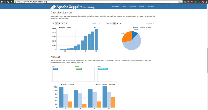
0-z-homepage1

0-z-homepage2

However, the latest official release, version 0.5.0, does not yet support the R programming language. Fortunately NFLabs, the company driving this open source project, pointed me this pull request that provides an R Interpreter. An Interpreter is a plug-in which enables zeppelin users to use a specific language/data-processing-backend. For example to use scala code in Zeppelin, you need a spark interpreter. So, if you are impatient like I am for R-integration into Zeppelin, this tutorial will show you how to setup Zeppelin for use with R by building from source.

Prerequisites

  • We will launch Zeppelin through Bash shell on Linux. If you are using Windows OS I recommend that you install and use the Cygwin terminal (It provides functionality similar to a Linux distribution on Windows).
  • Make sure Java 1.7 and Maven 3.2.x are installed on your host machine and their environment variables are set.

Build Zeppelin from Source

Step 1: Download Zeppelin Source Code

Go to this github branch and download the source code. Alternatively copy and paste this link into your web browser: https://github.com/elbamos/incubator-zeppelin/tree/rinterpreter

2-z-download-branch

In my case I have downloaded and unzipped the folder onto my Desktop

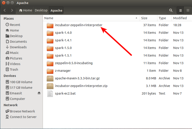
3-z-unzip-desktop

Step 2: Build Zeppelin

Run the following code in your terminal to build zeppelin on your host machine in local mode. If you are installing on a cluster then add these options found in the Zeppelin documentation.

$ cd Desktop/Apache/incubator-zeppelin-rinterpreter

$ mvn clean package -DskipTests

4-z-build-source

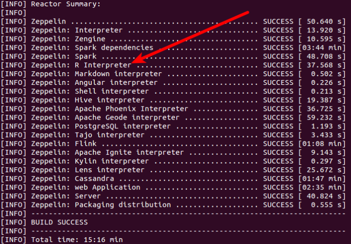
This will take around 6 minutes to build zeppelin, Spark and all interpreters including R, Markdown, Hive, Shell, and others. (as shown in the image below).

15mins

Step 3: Start Zeppelin

Run the following command to start zeppelin.

$ ./bin/zeppelin-daemon.sh start

start

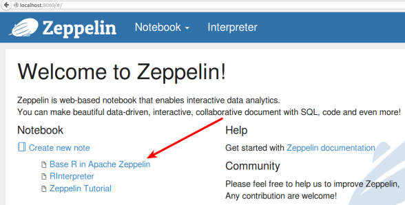
Go to localhost on your web browser and listen on port 8080. (i.e. http://localhost:8080). At this point you are ready to start creating interactive notebooks with code and graphs in Zeppelin.

6-z

Interactive Data Science

Step 1: Create a Notebook

Click the dropdown arrow next to the “Notebook” page and click “Create new note”.

6-z-create-note

Give your notebook a name or you can use the assigned default name. I named mine “Base R in Apache Zeppelin”.

6-z-my-notebook

Step 2: Start your Analysis

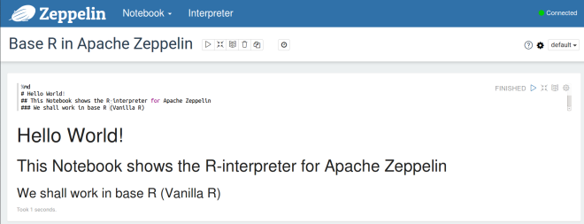
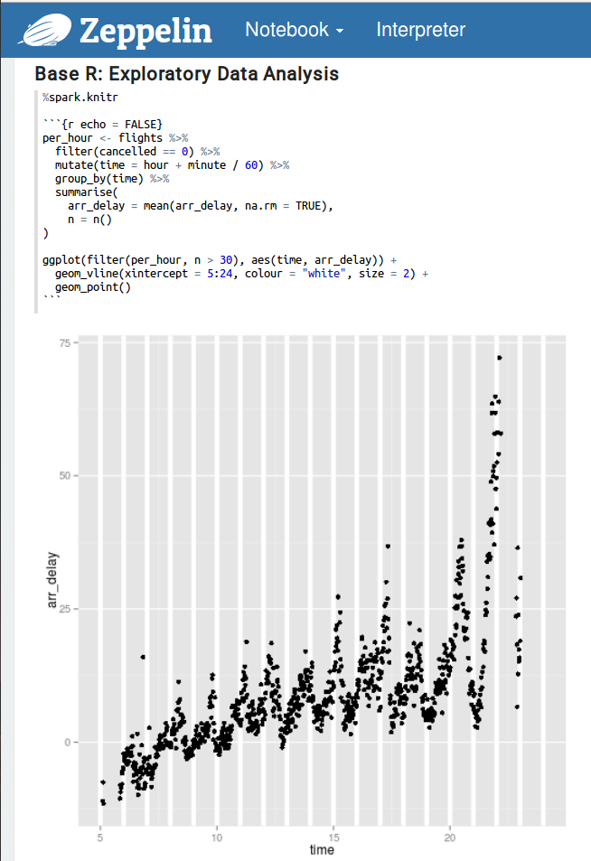
To use R, use the “%spark.r” or “%spark.knitr” tags as shown in the images below. First let’s use markdown to write some instruction text.

7-z-md

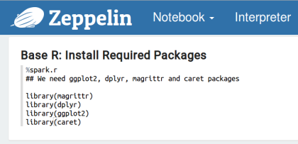
Now let’s install some packages that we may need for our analysis.

8-z-install-packages

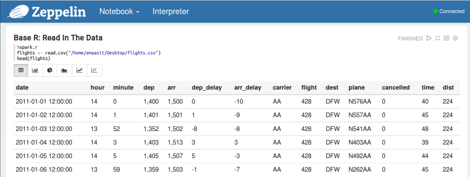
Now let’s read in our data set. We shall use the “flights” dataset which shows flights departing New York in 2013.

9-z-read-df

Now let’s do some data manipulation using dplyr (with the pipe operator)

10-z-data-manipulation

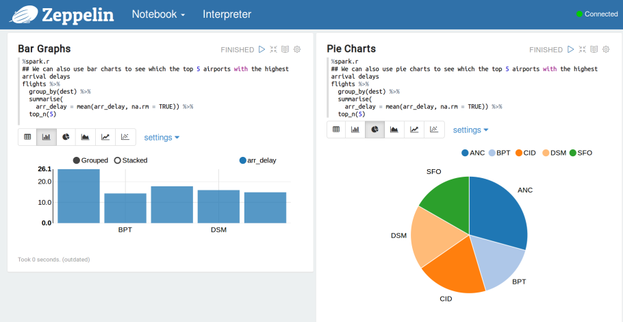
You can also use bar graphs and pie charts to visualize some descriptive statistics from your data.

10-z-data-man2

Now let’s do some data exploration with ggplot2

11-ggplot2

Now let’s do some statistical machine learning using the caret package.

13-ml

13-lm-2

How about creating some maps.

14-maps

Final Remarks

Zeppelin allows you to create interactive documents with beautiful graphs using multiple programming languages. The objective of this post was to help you setup Zeppelin for use with the R programming language. Hopefully the Project Management Committees (PMC) of this wonderful open source project can release the next version with an R interpreter. It will surely make it easier to launch Zeppelin faster without having to build from source.

Also it’s worth mentioning that there is another R interpreter for Zeppelin produced by the folks at Data Layer. You can find instructions on how to use it here: https://github.com/datalayer/zeppelin-R-interpreter.

Try out both interpreters and share your experiences in the comments section below.

Moving Ahead

As a follow-up to this post, We shall see how to use Apache Spark (especially SparkR) within Zeppelin in the next blog post.


Filed under: Apache Spark, Data Science, Machine Learning, R, SparkR, Zeppelin Tagged: Data Science, R, Zeppelin

To leave a comment for the author, please follow the link and comment on their blog: SparkIQ Labs Blog » R.

R-bloggers.com offers daily e-mail updates about R news and tutorials on topics such as: Data science, Big Data, R jobs, visualization (ggplot2, Boxplots, maps, animation), programming (RStudio, Sweave, LaTeX, SQL, Eclipse, git, hadoop, Web Scraping) statistics (regression, PCA, time series, trading) and more...

Analyzing 1.1 Billion NYC Taxi and Uber Trips, with a Vengeance

$
0
0

(This article was first published on Category: R | Todd W. Schneider, and kindly contributed to R-bloggers)

The New York City Taxi & Limousine Commission has released a staggeringly detailed historical dataset covering over 1.1 billion individual taxi trips in the city from January 2009 through June 2015. Taken as a whole, the detailed trip-level data is more than just a vast list of taxi pickup and drop off coordinates: it’s a story of New York. How bad is the rush hour traffic from Midtown to JFK? Where does the Bridge and Tunnel crowd hang out on Saturday nights? What time do investment bankers get to work? How has Uber changed the landscape for taxis? And could Bruce Willis and Samuel L. Jackson have made it from 72nd and Broadway to Wall Street in less than 30 minutes? The dataset addresses all of these questions and many more.

I mapped the coordinates of every trip to local census tracts and neighborhoods, then set about in an attempt to extract stories and meaning from the data. This post covers a lot, but for those who want to pursue more analysis on their own: everything in this post—the data, software, and code—is freely available. Full instructions to download and analyze the data for yourself are available on GitHub.

Table of Contents

  1. Maps
  2. The Data
  3. Borough Trends, and the Rise of Uber
  4. Airport Traffic
  5. On the Realism of Die Hard 3
  6. How Does Weather Affect Taxi and Uber Ridership?
  7. NYC Late Night Taxi Index
  8. The Bridge and Tunnel Crowd
  9. Northside Williamsburg
  10. Privacy Concerns
  11. Investment Bankers
  12. Parting Thoughts

Maps

I’m certainly not the first person to use the public taxi data to make maps, but I hadn’t previously seen a map that includes the entire dataset of pickups and drop offs since 2009 for both yellow and green taxis. You can click the maps to view high resolution versions:

These maps show every taxi pickup and drop off, respectively, in New York City from 2009–2015. The maps are made up of tiny dots, where brighter regions indicate more taxi activity. The green tinted regions represent activity by green boro taxis, which can only pick up passengers in upper Manhattan and the outer boroughs. Notice how pickups are more heavily concentrated in Manhattan, while drop offs extend further into the outer boroughs.

If you think these are pretty, I recommend checking out the high resolution images of pickups and drop offs.

NYC Taxi Data

The official TLC trip record dataset contains data for over 1.1 billion taxi trips from January 2009 through June 2015, covering both yellow and green taxis. Each individual trip record contains precise location coordinates for where the trip started and ended, timestamps for when the trip started and ended, plus a few other variables including fare amount, payment method, and distance traveled.

I used PostgreSQL to store the data and PostGIS to perform geographic calculations, including the heavy lifting of mapping latitude/longitude coordinates to NYC census tracts and neighborhoods. The full dataset takes up 267 GB on disk, before adding any indexes. For more detailed information on the database schema and geographic calculations, take a look at the GitHub repository.

Uber Data

Thanks to the folks at FiveThirtyEight, there is also some publicly available data covering nearly 19 million Uber rides in NYC from April–September 2014 and January–June 2015, which I’ve incorporated into the dataset. The Uber data is not as detailed as the taxi data, in particular Uber provides time and location for pickups only, not drop offs, but I wanted to provide a unified dataset including all available taxi and Uber data. Each trip in the dataset has a cab_type_id, which indicates whether the trip was in a yellow taxi, green taxi, or Uber car.

The introduction of the green boro taxi program in August 2013 dramatically increased the amount of taxi activity in the outer boroughs. Here’s a graph of taxi pickups in Brooklyn, the most populous borough, split by cab type:

brooklyn pickups

From 2009–2013, a period during which migration from Manhattan to Brooklyn generally increased, yellow taxis nearly doubled the number of pickups they made in Brooklyn.

Once boro taxis appeared on the scene, though, the green taxis quickly overtook yellow taxis so that as of June 2015, green taxis accounted for 70% of Brooklyn’s 850,000 monthly taxi pickups, while yellow taxis have decreased Brooklyn pickups back to their 2009 rate. Yellow taxis still account for more drop offs in Brooklyn, since many people continue to take taxis from Manhattan to Brooklyn, but even in drop offs, the green taxis are closing the gap.

Let’s add Uber into the mix. I live in Brooklyn, and although I sometimes take taxis, an anecdotal review of my credit card statements suggests that I take about four times as many Ubers as I do taxis. It turns out I’m not alone: between June 2014 and June 2015, the number of Uber pickups in Brooklyn grew by 525%! As of June 2015, the most recent data available when I wrote this, Uber accounts for more than twice as many pickups in Brooklyn compared to yellow taxis, and is rapidly approaching the popularity of green taxis:

brooklyn uber pickups

Note that Uber data is only available from Apr 2014–Sep 2014, then from Jan 2015–Jun 2015, hence the gap in the graph

Manhattan, not surprisingly, accounts for by far the largest number of taxi pickups of any borough. In any given month, around 85% of all NYC taxi pickups occur in Manhattan, and most of those are made by yellow taxis. Even though green taxis are allowed to operate in upper Manhattan, they account for barely a fraction of yellow taxi activity:

manhattan pickups

Uber has grown dramatically in Manhattan as well, notching a 275% increase in pickups from June 2014 to June 2015, while taxi pickups declined by 9% over the same period. Uber made 1.4 million more Manhattan pickups in June 2015 than it did in June 2014, while taxis made 1.1 million fewer pickups. However, even though Uber picked up nearly 2 million Manhattan passengers in June 2015, Uber still accounts for less than 15% of total Manhattan pickups:

manhattan uber pickups

Queens still has more yellow taxi pickups than green taxi pickups, but that’s entirely because LaGuardia and JFK airports are both in Queens, and they are heavily served by yellow taxis. And although Uber has experienced nearly Brooklyn-like growth in Queens, it still lags behind yellow and green taxis, though again the yellow taxis are heavily influenced by airport pickups:

queens uber pickups

If we restrict to pickups at LaGuardia and JFK Airports, we can see that Uber has grown to over 100,000 monthly pickups, but yellow cabs still shuttle over 80% of car-hailing airport passengers back into the city:

airport pickups

The Bronx and Staten Island have significantly lower taxi volume, but you can see graphs for both on GitHub. The most noteworthy observations are that almost no yellow taxis venture to the Bronx, and Uber is already more popular than taxis on Staten Island.

How Long does it Take to Get to an NYC Airport?

Most of these vehicles [heading to JFK Airport] would undoubtedly be using the Van Wyck Expressway; Moses’s stated purpose in proposing it was to provide a direct route to the airport from mid-Manhattan. But the Van Wyck Expressway was designed to carry—under “optimum” conditions (good weather, no accidents or other delays)—2,630 vehicles per hour. Even if the only traffic using the Van Wyck was JFK traffic, the expressway’s capacity would not be sufficient to handle it.

[…] The air age was just beginning: air traffic was obviously going to boom to immense dimensions. If the Van Wyck expressway could not come anywhere near handling JFK’s traffic when that traffic was 10,000 persons per hour, what was going to happen when that traffic increased to 15,000 persons per hour? To 20,000?

—Robert Caro, The Power Broker: Robert Moses and the Fall of New York (1974)

A subject near and dear to all New Yorkers’ hearts: how far in advance do you have to hail a cab in order to make your flight at one of the three area airports? Of course, this depends on many factors: is there bad rush hour traffic? Is the UN in session? Will your cab driver know a “secret” shortcut to avoid the day’s inevitable bottleneck on the Van Wyck?

I took all weekday taxi trips to the airports and calculated the distribution of how long it took to travel from each neighborhood to the airports at each hour of the day. In most cases, the worst hour to travel to an airport is 4–5 PM. For example, the median taxi trip leaving Midtown headed for JFK Airport between 4 and 5 PM takes 64 minutes! 10% of trips during that hour take over 84 minutes—good luck making your flight in that case.

If you left Midtown heading for JFK between 10 and 11 AM, you’d face a median trip time of 38 minutes, with a 90% chance of getting there in less than 50 minutes. Google Maps estimates about an hour travel time on public transit from Bryant Park to JFK, so depending on the time of day and how close you are to a subway stop, your expected travel time might be better on public transit than in a cab, and you could save a bunch of money.

The stories are similar for traveling to LaGuardia and Newark airports, and from other neighborhoods. You can see the graphs for airport travel times from any neighborhood by selecting it in the dropdown below:

Turn on javascript (or click through from RSS) to view airport graphs for other neighborhoods.

image

Travel time from Midtown, Manhattan to…

LaGuardia Airport

image

JFK Airport

image

Newark Airport

image

You can view airport graphs for other neighborhoods by selecting a neighborhood from the dropdown above.

Could Bruce Willis and Samuel L. Jackson have made it from the Upper West Side to Wall Street in 30 minutes?

Airports aren’t the only destinations that suffer from traffic congestion. In Die Hard: With a Vengeance, John McClane (Willis) and Zeus Carver (Jackson) have to make it from 72nd and Broadway to the Wall Street 2/3 subway station during morning rush hour in less than 30 minutes, or else a bomb will go off. They commandeer a taxi, drive it frantically through Central Park, tailgate an ambulance, and just barely make it in time (of course the bomb goes off anyway…). Thanks to the TLC’s publicly available data, we can finally address audience concerns about the realism of this sequence.

McClane and Carver leave the Upper West Side at 9:50 AM, so I took all taxi rides that:

  • Picked up in the Upper West Side census tracts between West 70th and West 74th streets
  • Dropped off in the downtown tract containing the Wall Street 2/3 subway stop
  • Picked up on a weekday morning between 9:20 and 10:20 AM

And made a histogram of travel times:

die hard 3

There are 580 such taxi trips in the dataset, with a mean travel time of 29.8 minutes, and a median of 29 minutes. That means that half of such trips actually made it within the allotted time of 30 minutes! Now, our heroes might need a few minutes to commandeer a cab and get down to the subway platform on foot, so if we allot 3 minutes for those tasks and 27 minutes for driving, then only 39% of trips make it in 27 minutes or less. Still, in the movie they make it seem like a herculean task with almost zero probability of success, when in reality it’s just about average. This seems to be the rare action movie sequence which is actually easier to recreate in real life than in the movies!

How Does Weather Affect Taxi and Uber Ridership?

Since 2009, the days with the fewest city-wide taxi trips all have obvious relationships to the weather. The days with the fewest taxi trips were:

  1. Sunday, August 28, 2011, Hurricane Irene, 28,596 trips
  2. Monday, December 27, 2010, North American blizzard, 69,650 trips
  3. Monday, October 29, 2012: Hurricane Sandy, 111,605 trips

I downloaded daily Central Park weather data from the National Climatic Data Center, and joined it to the taxi data to see if we could learn anything else about the relationship between weather and taxi rides. There are lots of confounding variables, including seasonal trends, annual growth due to boro taxis, and whether weather events happen to fall on weekdays or weekends, but it would appear that snowfall has a significant negative impact on daily taxi ridership:

snowfall

On the other hand, rain alone does not seem to affect total daily ridership:

precipitation

Since Uber trip data is only available for a handful of months, it’s more difficult to measure the impact of weather on Uber ridership. Uber is well-known for its surge pricing during times of high demand, which often includes inclement weather. There were a handful of rainy and snowy days in the first half of 2015 when Uber data is available, so for each rain/snow day, I calculated the total number of trips made by taxis and Ubers, and compared that to each service’s daily average over the previous week. For example, Uber’s ratio of 69% on 1/26/15 means that there were 69% as many Uber trips made that day compared to Uber’s daily average from 1/19–1/25:

Date Snowfall in inches Taxi trips vs. prev week Uber trips vs. prev week
1/26/15 5.5 55% 69%
1/27/15 4.3 33% 41%
2/2/15 5.0 91% 107%
3/1/15 4.8 85% 88%
3/5/15 7.5 83% 100%
3/20/15 4.5 105% 134%
Date Precipitation in inches Taxi trips vs. prev week Uber trips vs. prev week
1/18/15 2.1 98% 112%
3/14/15 0.8 114% 130%
4/20/15 1.4 90% 105%
5/31/15 1.5 96% 116%
6/1/15 0.7 99% 106%
6/21/15 0.6 92% 94%
6/27/15 1.1 114% 147%

Although this data does not conclusively prove anything, on every single inclement weather day in 2015, in both rain and snow, Uber provided more trips relative to its previous week’s average than taxis did. Part of this is probably because the number of Uber cars is still growing, so all things held constant, we’d expect Uber to provide more trips on each successive day, while total taxi trips stay flat. But for Uber’s ratio to be higher every single day seems unlikely to be random chance, though again I have no justification to make any strong claims. Whether it’s surge pricing or something else, Uber’s capacity seems less negatively impacted by bad weather relative to taxi capacity.

NYC Late Night Taxi Index

Many real estate listings these days include information about the neighborhood: rankings of local schools, walkability scores, and types of local businesses. We can use the taxi data to draw some inferences about what parts of the city are popular for going out late at night by looking at the percentage of each census tract’s taxi pickups that occur between 10 PM and 5 AM—the time period I’ve deemed “late night.”

Some people want to live in a city that never sleeps, while others prefer their peace and quiet. According to the late night taxi index, if you’re looking for a neighborhood with vibrant nightlife, try Williamsburg, Greenpoint, or Bushwick in Brooklyn. The census tract with the highest late night taxi index is in East Williamsburg, where 76% of taxi pickups occur between 10 PM and 5 AM. If you insist on Manhattan, then your best bets are the Lower East Side or the Meatpacking District.

Conversely, if you want to avoid the nighttime commotion, head uptown to the Upper East or Upper West Side (if you’re not already there…). The stretch in the east 80s between 5th Avenue and Park Avenue has the lowest late night taxi index, with only 5% of all taxi pickups occurring during the nighttime hours.

Here’s a map of all census tracts that had at least 50,000 taxi pickups, where darker shading represents a higher score on the late night taxi index:


late night taxi map

BK nights: 76% of the taxi pickups that occur in one of East Williamsburg’s census tracts happen between 10 PM and 5 AM, the highest rate in the city. A paltry 5% of taxi pickups in some Upper East Side tracts occur in the late night hours

Whither the Bridge and Tunnel Crowd?

The “bridge and tunnel” moniker applies, on a literal level, to anyone who travels onto the island of Manhattan via a bridge or tunnel, most often from New Jersey, Long Island, or the outer boroughs. Typically it’s considered an insult, though, with the emerging popularity of the outer boroughs, well, let’s just say the Times is on it.

In order to measure B&T destinations from the taxi data, I isolated all trips originating near Penn Station on Saturday evenings between 6 PM and midnight. Penn Station serves as the point of disembarkation for New Jersey Transit and Long Island Rail Road, so although not everyone hailing a taxi around Penn Station on a Saturday evening just took the train into the city, it should be at least a decent proxy for B&T trends. Here’s the map of the neighborhoods where these rides dropped off:

bridge and tunnel

The most popular destinations for B&T trips are in Murray Hill, the Meatpacking District, Chelsea, and Midtown. We can even drill down to the individual trip level to see exactly where these trips wind up. Here’s a map of Murray Hill, the most popular B&T destination, where each dot represents a single Saturday evening taxi trip originating at Penn Station:

murray hill

As reported, repeatedly, in the NYT, the heart of Murray Hill nightlife lies along 3rd Avenue, in particular the stretch from 32nd to 35th streets. Taxi data shows the plurality of Saturday evening taxi trips from Penn Station drop off in this area, with additional clusters in the high 20s on 3rd Avenue, further east along 34th Street, and a spot on East 39th Street between 1st and 2nd avenues. With a bit more work we might be able to reverse geocode these coordinates to actual bar names, perhaps putting a more scientific spin on this classic of the genre from Complex.

Northside Williamsburg

According to taxi activity, the most ascendant census tract in the entire city since 2009 lies on Williamsburg’s north side, bounded by North 14th St to the north, Berry St to the east, North 7th St to the south, and the East River to the west:

northside williamsburg

The Northside neighborhood is known for its nightlife: a full 72% of pickups occur during the late night hours. It’s difficult to compare 2009–2015 taxi growth across census tracts and boroughs because of the introduction of the green boro taxi program, but the Northside tract had a larger increase in total taxi pickups over that time period than any other tract in the city, with the exception of the airports:

northside williamsburg

Even before the boro taxi program began in August 2013, Northside Williamsburg experienced a dramatic increase in taxi activity, growing from a mere 500 monthly pickups in June 2009, to 10,000 in June 2013, and 25,000 by June 2015. Let’s look at an animated map of taxi pickups to see if we can learn anything:

map

The cool thing about the animation is that it lets us pinpoint the exact locations of some of the more popular Northside businesses to open in the past few years, in particular along Wythe Avenue:

  • May 2012: Wythe Hotel, Wythe and N 11th
  • January 2013: Output nightclub, Wythe and N 12th
  • March 2014: Verboten nightclub, N 11th between Wythe and Kent

Meanwhile, I’m sure the developers of the future William Vale and Hoxton hotels hope that the Northside’s inexorable rise continues, but at least according to taxi data, pickups have remained stable since mid-2014, perhaps indicating that the neighborhood’s popularity has plateaued?

Privacy Concerns, East Hampton Edition

The first time the TLC released public taxi data in 2013, following a FOIL request by Chris Whong, it included supposedly anonymized taxi medallion numbers for every trip. In fact it was possible to decode each trip’s actual medallion number, as described by Vijay Pandurangan. This led to many discussions about data privacy, and the TLC removed all information about medallion numbers from the more recent data releases.

But the data still contains precise latitude and longitude coordinates, which can potentially be used to determine where people live, work, socialize, and so on. This is all fun and games when we’re looking at the hottest new techno club in Northside Williamsburg, but when it’s people’s homes it gets a bit weird. NYC is of course very dense, and if you take a rush hour taxi ride from one populus area to another, say Grand Central Terminal to the Upper East Side, it’s unlikely that there’s anything unique about your trip that would let someone figure out where you live or work.

But what if you’re going somewhere a bit off the beaten path for taxis? In that case, your trip might well be unique, and it might reveal information about you. For example, I don’t know who owns one of theses beautiful oceanfront homes on East Hampton’s exclusive Further Lane (exact address redacted to protect the innocent):


further lane

But I do know the exact Brooklyn Heights location and time from which someone (not necessarily the owner) hailed a cab, rode 106.6 miles, and paid a $400 fare with a credit card, including a $110.50 tip. If the TLC truly wanted to remove potentially personal information, they would have to remove latitude and longitude coordinates from the dataset entirely. There’s a tension that public data is supposed to let people know how well the taxi system serves different parts of the city, so maybe the TLC should provide census tracts instead of coordinates, or perhaps only coordinates within busy parts of Manhattan, but providing coordinates that uniquely identify a rider’s home feels excessive.

Investment Bankers

While we’re on the topic of the Hamptons: we’ve already covered the hipsters of Williamsburg and the B&Ts of Murray Hill, why not see what the taxi data can tell us about investment bankers, yet another of New York’s distinctive subcultures?

Goldman Sachs lends itself nicely to analysis because its headquarters at 200 West Street has a dedicated driveway, marked “Hudson River Greenway” on this Google Map:

goldman sachs

We can isolate all taxi trips that dropped off in that driveway to get a sense of where Goldman Sachs employees—at least the ones who take taxis—come from in the mornings, and when they arrive. Here’s a histogram of weekday drop off times at 200 West Street:

goldman sachs drop offs

The cabs start dropping off around 5 AM, then peak hours are 7–9 AM, before tapering off in the afternoon. Presumably most of the post-morning drop offs are visitors as opposed to employees. If we restrict to drop offs before 10 AM, the median drop off time is 7:59 AM, and 25% of drop offs happen before 7:08 AM.

A few blocks to the north is Citigroup’s headquarters at 388 Greenwich St, and although the building doesn’t appear to have a dedicated driveway the way Goldman does, we can still isolate taxis that drop off directly in front of the building to see what time Citigroup’s workers arrive in the morning:

citigroup drop offs

Some of the evening drop offs near Citigroup are probably for the bars and restaurants across the street, but again the morning drop offs are probably mostly Citigroup employees. Citigroup’s morning arrival stats are comparable to Goldman’s: a median arrival of 7:51 AM, and 25% of drop offs happen before 7:03 AM.

The top neighborhoods for taxi pickups that drop off at Goldman Sachs or Citigroup on weekday mornings are:

  1. West Village
  2. Chelsea-Flatiron-Union Square
  3. SoHo-Tribeca

So what’s the deal, do bankers not live above 14th St (or maybe 23rd St) anymore? Alas, there are still plenty of trips from the stodgier parts further uptown, and it’s certainly possible that people coming from uptown are more likely to take the subway, private cars, or other modes of transport, so the taxi data is by no means conclusive. But still, the cool kids have been living downtown for a while now, why should the bankers be any exception?

Parting Thoughts

As I mentioned in the introduction, this post covers a lot. And even then, I feel like it barely scratches the surface of the information available in the full dataset. For example, did you know that in January 2009, just over 20% of taxi fares were paid with a credit card, but as of June 2015, that number has grown to over 60% of all fares?

cash vs credit

And for more expensive taxi trips, riders now pay via credit card more than 75% of the time:

cash vs credit

There are endless analyses to be done, and more datasets that could be merged with the taxi data for further investigation. The Citi Bike program releases public ride data; I wonder if the introduction of a bike-share system had a material impact on taxi ridership? And maybe we could quantify fairweather fandom by measuring how taxi volume to Yankee Stadium and Citi Field fluctuates based on the Yankees’ and Mets’ records?

There are investors out there who use satellite imagery to make investment decisions, e.g. if there are lots of cars in a department store’s parking lots this holiday season, maybe it’s time to buy. You might be able to do something similar with the taxi data: is airline market share shifting, based on traffic through JetBlue’s terminal at JFK vs. Delta’s terminal at LaGuardia? Is demand for lumber at all correlated to how many people are loading up on IKEA furniture in Red Hook?

I’d imagine that people will continue to obtain Uber data via FOIL requests, so it will be interesting to see how that unfolds amidst increased tension with city government and constant media speculation about a possible IPO.

Lastly, I mentioned the “medium data revolution” in my previous post about Fannie Mae and Freddie Mac, and the same ethos applies here. Not too long ago, the idea of downloading, processing, and analyzing 267 GB of raw data containing 1.1 billion rows on a commodity laptop would have been almost laughably naive. Today, not only is it possible on a MacBook Air, but there are increasingly more open-source software tools available to aid in the process. I’m partial to PostgreSQL and R, but those are implementation details: increasingly, the limiting factor of data analysis is not computational horsepower, but human curiosity and creativity.

GitHub

If you’re interested in getting the data and doing your own analysis, or just want to read a bit about the more technical details, head over to the GitHub repository.

if (!mobileDevice()) { $("#nyc-cartodb-preview").html('');

$("#further-lane-preview").html(''); }

var baseDir = "/data/taxi/airport/";

$("#airport-nta").on("change", function() { var $option = $("#airport-nta option:selected"); $("#airport-nta-header").text($option.text() + ", " + $option.parent().attr("label")); var nta = $option.val() $("#nta-map").attr("src", baseDir + nta + "_map.png"); $("#travel-LGA").attr("src", baseDir + nta + "_" + "LGA.png"); $("#travel-JFK").attr("src", baseDir + nta + "_" + "JFK.png"); $("#travel-EWR").attr("src", baseDir + nta + "_" + "EWR.png"); }); });

To leave a comment for the author, please follow the link and comment on their blog: Category: R | Todd W. Schneider.

R-bloggers.com offers daily e-mail updates about R news and tutorials on topics such as: Data science, Big Data, R jobs, visualization (ggplot2, Boxplots, maps, animation), programming (RStudio, Sweave, LaTeX, SQL, Eclipse, git, hadoop, Web Scraping) statistics (regression, PCA, time series, trading) and more...

Big RAM is eating big data – Size of datasets used for analytics

$
0
0

(This article was first published on Data Science Los Angeles » R, and kindly contributed to R-bloggers)

With so much hype about “big data” and the industry pushing for “big data” analytical tools for everyone, the question arises how many people have big data (for analytics) and how many of them really need these tools (which are more complex and often more immature compared to the traditional tools for analytics).

During the process of data analysis we typically start with some larger “raw” datasets, we transform/clean/prepare them for modeling (typically with SQL-like transformations), and then we use these refined and usually smaller datasets for modeling/machine learning.

In terms of computational resources needed I like to think in terms of the pyramid of analytical tasks. I’m mostly interested in tools for non-linear machine learning, the distribution of dataset sizes practitioners have to deal with in this area, and how all this is changing in time.

Size of datasets in KDnuggets surveys

KDnuggets has conducted surveys of “the largest dataset you analyzed/data mined” (yearly since 2006). It surveys the largest dataset for a given practitioner (instead of the typical one), it measures size in bytes (rather than my preference for number of records), and it surveys raw data sizes (I would be more interested in the size of the refined datasets used for modeling). Nevertheless, it provides data points interesting to study. (One could also question the representativeness of the sample, changing respondents over the years etc.)

The annual polls are available on various URLs and I compiled the data into a csv file. The cumulative distribution of dataset sizes for a few select years is plotted below:

The dataset sizes vary over many orders of magnitude with most users in the 10 Megabytes to 10 Terabytes range (a huge range), but furthermore with some users in the many Petabytes range.

It seems the cumulative distribution function in the 0.1-0.9 range (on the vertical axis) follows a linear dependency vs log(size):

Fitting a linear regression lm(log10(size_GB) ~ cum_freq + year, ...) for that range, one gets coefficients year: 0.075 and cum_freq: 6.0. We can use this “model” as a smoother in the discussion below.

The above results imply an annual rate of increase of datasets of 10^0.075 ~ 1.2 that is 20%.

The median dataset size increases from 6 GB (2006) to 30 GB (2015). That’s all tiny, even more for raw datasets, and it implies that over 50% of analytics professionals work with datasets that (even in raw form) can fit in the memory of a single machine, therefore it can be definitely dealt with using simple analytical tools.

On the other hand, the dataset sizes are distributed over many orders of magnitude, e.g. the larger quantiles based on smoothing for 2015 are:

quantile value
50% 30 GB
60% 120 GB
70% 0.5 TB
80% 2 TB
90% 8 TB

The Terabyte range is the home turf of data warehouses, MPP/analytical databases and the like, but many organizations are using “big data” tools (Hadoop/Spark) for those sizes.

About 5% of uses are in the Petabytes range and likely use Hadoop/Spark. While the hype around big data, “exponential growth” of sensors and Internet-of-Things (IoT) etc. suggests a more rapid growth rate than 20% yearly, the simple linear fit used above does not extend over the 90% percentile and it’s hard to tell any trends for these large sizes from this survey data.

Size of datasets in other studies

A Microsoft research study has found that the median size of input jobs submitted to an analytic production Hadoop cluster at Microsoft in 2011 was 14 GB, and it infers from other studies that the median data size of input jobs in a Yahoo production cluster was 12 GB, while 90% of the inputs in an analytical production cluster at Facebook were of size less than 100 GB.

Size of datasets for modeling

Unfortunately it is unclear from all this discussion above what’s the distribution of dataset sizes used for modeling/machine learning (my primary area of interest). Some informal surveys I have done at various meetups and conference talks suggest that for at least 90% of non-linear supervised learning use cases the data fits well in the RAM of a single machine and can be processed by high-performant tools like xgboost or H2O or in many cases (I estimate 60%) even by using R packages or Python sklearn (see this github repo for a benchmark of the most commonly used open source tools for non-linear supervised learning). Many of the “big data” tools in this domain (non-linear supervised learning) are clunky, slow, memory-inefficient and buggy (affecting predictive accuracy).

Size of RAM of a single machine

The size of EC2 instances with largest RAM:

year type RAM (GB)
2007 m1.xlarge 15
2009 m2.4xlarge 68
2012 hs1.8xlarge 117
2014 r3.8xlarge 244
2016* x1 2 TB

With different assumptions one can get yearly RAM increase rates of 50%, 60% or 70%:

from_year from_GB to_year to_GB rate
2007 15 2014 244 50%
2007 15 2016 2000 70%
2009 68 2016 2000 60%

Either way, the rate of increase of RAM of a single machine has been much higher than the rate of increase of the typical dataset used for analytics (20%). This has huge implications in terms of in-memory (distributed) processing (e.g. SQL) and single-machine processing (e.g. non-linear machine learning or even plain old R/Python). Big RAM is eating big data. For example, the fact that many datasets (already refined for modeling) now fit in the RAM of a single high-end server and one can train machine learning models on them without distributed computing has been noted by many top large scale machine learning experts.

Of course, maybe data (useful for analytics) is increasing faster, and the slower 20% per yr increase based on the KDnuggets poll just shows our inability (or the inability of our tools) to deal with ever larger data or maybe there is some strong bias and non-representativeness in the KDnuggets survey etc. Maybe your data increases faster. Maybe you think data is bigger and increasing faster. But facts should trump opinions, so I’d love to see more data and analysis either supporting or contradicting the above results.

To leave a comment for the author, please follow the link and comment on their blog: Data Science Los Angeles » R.

R-bloggers.com offers daily e-mail updates about R news and tutorials on topics such as: Data science, Big Data, R jobs, visualization (ggplot2, Boxplots, maps, animation), programming (RStudio, Sweave, LaTeX, SQL, Eclipse, git, hadoop, Web Scraping) statistics (regression, PCA, time series, trading) and more...

statistically significant trends with multiple years of complex survey data

$
0
0

(This article was first published on asdfree, and kindly contributed to R-bloggers)


guest post by my friend thomas yokota, an oahu-based epidemiologist. palmero professor vito muggeo wrote the joinpoint analysis section of the code below to demonstrate that the segmented package eliminates the need for external (registration-only, windows-only) software. survey package creator and professor thomas lumley wrote the svypredmarg function to replicate SUDAAN's PREDMARG command and match the cdc to the decimal. richard lowry, m.d. at the centers for disease control & prevention wrote the original linear trend analysis then answered our infinite questions. biquadratic thanks.
The purpose of this analysis is to make statements such as, “there was a significant linear decrease in the prevalence of high school aged americans who have ever smoked a cigarette across the period 1999-2011” with complex sample survey data.
 
This step-by-step walkthrough exactly reproduces the statistics presented in the Center for Disease Control & Prevention's (CDC) linear trend analysis, using free and open source methods rather than proprietary or restricted software.
 
The example below displays only linearized designs (created with the svydesign function). For more detail about how to reproduce this analysis with a replicate-weighted design (created with the svrepdesign function), see note below section #4.

(1) Data Importation

Prior to running this analysis script, the Youth Risk Behavioral Surveillance System (YRBSS) 1991-2011 single-year files must all be loaded as R data files (.rda) on your local machine. Running the download automation script will create the appropriate files. If you need assistance with the data-loading step, first review the main YRBSS blog post.

# setInternet2( FALSE )     # # only windows users need this line
# library(downloader)
# setwd( "C:/My Directory/YRBSS/" )
# source_url( "https://raw.github.com/ajdamico/asdfree/master/Youth%20Risk%20Behavior%20Surveillance%20System/download%20all%20microdata.R" , prompt = FALSE , echo = TRUE )


(2) Load Required Packages, Options, External Functions

# remove the # in order to run this install.packages line only once
# install.packages( c( "segmented" , "downloader" , "plyr" , "survey" , "ggplot2" , "ggthemes" , "texreg" ) )

# Muggeo V. (2008) Segmented: an R package to fit regression models with broken-line relationships. R News, 8, 1: 20-25.
library(segmented) # determine segmented relationships in regression models

library(downloader) # downloads and then runs the source() function on scripts from github
library(plyr) # contains the rbind.fill() function, which stacks two data frames even if they don't contain the same columns. the rbind() function does not do this
library(survey) # load survey package (analyzes complex design surveys)
library(ggplot2) # load ggplot2 package (plots data according to the grammar of graphics)
library(ggthemes) # load extra themes, scales, and geoms for ggplot2
library(texreg) # converts output to latex tables

# set R to produce conservative standard errors instead of crashing
# http://r-survey.r-forge.r-project.org/survey/exmample-lonely.html
options( survey.lonely.psu = "adjust" )
# this setting matches the MISSUNIT option in SUDAAN
# SAS uses "remove" instead of "adjust" by default,
# the table target replication was generated with SAS,
# so if you want to get closer to that, use "remove"


# load dr. thomas lumley's `svypredmeans` function, which replicates SUDAAN's PREDMARG command
source_url( "https://gist.githubusercontent.com/tslumley/2e74cd0ac12a671d2724/raw/0f5feeb68118920532f5b7d67926ec5621d48975/svypredmeans.R" , prompt = FALSE , quiet = TRUE )

For more detail about svypredmeans, see https://gist.github.com/tslumley/2e74cd0ac12a671d2724.


(3) Harmonize and Stack Multiple Years of Survey Data

This step is clearly dataset-specific. In order for your trend analysis to work, you'll need to figure out how to align the variables from multiple years of data into a trendable, stacked data.frame object.

# initiate an empty `y` object
y <- NULL

# loop through each year of YRBSS microdata
for ( year in seq( 1991 , 2011 , 2 ) ){

# load the current year
load( paste0( "yrbs" , year , ".rda" ) )

# tack on a `year` column
x$year <- year

# stack that year of data alongside the others,
# ignoring mis-matching columns
y <- rbind.fill( x , y )

# clear the single-year of microdata from RAM
rm( x )

}

# remove all unnecessary columns from the 1991-2011 multi-year stack
y <- y[ c( "q2" , "q3" , "q4" , "q23" , "q26" , "q27" , "q28" , "q29" , "year" , "psu" , "stratum" , "weight" , "raceeth" ) ]

# convert every column to numeric type
y[ , ] <- sapply( y[ , ] , as.numeric )

# construct year-specific recodes so that
# "ever smoked a cigarette" // grade // sex // race-ethnicity align across years
y <-
transform(

y ,

smoking =
as.numeric(
ifelse( year == 1991 , q23 ,
ifelse( year %in% c( 1993 , 2001:2009 ) , q28 ,
ifelse( year %in% 1995:1997 , q26 ,
ifelse( year %in% 1999 , q27 ,
ifelse( year %in% 2011 , q29 , NA ) ) ) ) )
) ,

raceeth =

ifelse( year %in% 1991:1997 ,
ifelse( q4 %in% 1:3 , q4 , ifelse( q4 %in% 4:6 , 4 , NA ) ) ,

ifelse( year %in% 1999:2005 ,
ifelse( q4 %in% 6 , 1 ,
ifelse( q4 %in% 3 , 2 ,
ifelse( q4 %in% c( 4 , 7 ) , 3 ,
ifelse( q4 %in% c( 1 , 2 , 5 , 8 ) , 4 , NA ) ) ) ) ,

ifelse( year %in% 2007:2011 ,
ifelse( raceeth %in% 5 , 1 ,
ifelse( raceeth %in% 3 , 2 ,
ifelse( raceeth %in% c( 6 , 7 ) , 3 ,
ifelse( raceeth %in% c( 1 , 2 , 4 , 8 ) , 4 , NA ) ) ) ) ,

NA ) ) ) ,

grade = ifelse( q3 == 5 , NA , as.numeric( q3 ) ) ,

sex = ifelse( q2 %in% 1:2 , q2 , NA )

)


# again remove unnecessary variables, keeping only the complex sample survey design columns
# plus independent/dependent variables to be used in the regression analyses
y <- y[ c( "year" , "psu" , "stratum" , "weight" , "smoking" , "raceeth" , "sex" , "grade" ) ]

# set female to the reference group
y$sex <- relevel( factor( y$sex ) , ref = "2" )

# set ever smoked=yes // white // 9th graders as the reference groups
for ( i in c( 'smoking' , 'raceeth' , 'grade' ) ) y[ , i ] <- relevel( factor( y[ , i ] ) , ref = "1" )


(4) Construct a Multi-Year Stacked Complex Survey Design Object

Before constructing a multi-year stacked design object, check out ?contr.poly - this function implements polynomials used in our trend analysis during step #6. For more detail on this subject, see page 216 of Applied Multiple Regression/Correlation Analysis for the Behavioral Sciences By Jacob Cohen, Patricia Cohen, Stephen G. West, Leona S. Aiken “The polynomials we have used as predictors to this point are natural polynomials, generated from the linear predictor by centering and the powering the linear predictor.”

# extract a linear contrast vector of length eleven,
# because we have eleven distinct years of yrbss data `seq( 1999 , 2011 , 2 )`
c11l <- contr.poly( 11 )[ , 1 ]

# also extract a quadratic (squared) contrast vector
c11q <- contr.poly( 11 )[ , 2 ]

# just in case, extract a cubic contrast vector
c11c <- contr.poly( 11 )[ , 3 ]

# for each record in the data set, tack on the linear, quadratic, and cubic contrast value
# these contrast values will serve as replacement for the linear `year` variable in any regression.

# year^1 term (linear)
y$t11l <- c11l[ match( y$year , seq( 1999 , 2011 , 2 ) ) ]

# year^2 term (quadratic)
y$t11q <- c11q[ match( y$year , seq( 1999 , 2011 , 2 ) ) ]

# year^3 term (cubic)
y$t11c <- c11c[ match( y$year , seq( 1999 , 2011 , 2 ) ) ]

# construct a complex sample survey design object
# stacking multiple years and accounting for `year` in the nested strata
des <-
svydesign(
id = ~psu ,
strata = ~interaction( stratum , year ) ,
data = y ,
weights = ~weight ,
nest = TRUE
)

Now we've got a multi-year stack of complex survey designs with linear, quadratic, and cubic contrast values appended. If you'd like more detail about stacking multiple years of complex survey data, review the CDC's manual on the topic. Hopefully we won't need anything beyond cubic, but let's find out.


Methods note about how to stack replication designs: This is only relevant if you are trying to create a des-like the object above but just have replicate weights and do not have the clustering information (psu). It is straightforward to construct a replication design from a linearized design (see as.svrepdesign). However, for privacy reasons, going in the opposite direction is much more challenging. Therefore, you'll need to do some dataset-specific homework on how to best stack multiple years of a replicate-weighted design to construct a multiple-year-stacked survey design like the object above.

If you'd like to experiment with how the two approaches differ (theoretically, very little), these publicly-available survey data sets include both replicate weights and, separately, clustering information:
     Medical Expenditure Panel Survey
     National Health and Nutrition Examination Survey
     Consumer Expenditure Survey

In most cases, omitting the year variable from the strata = ~interaction( stratum , year ) construction of des above will make your standard errors larger (conservative) -> ergo -> you can probably just..

rbind( file_with_repweights_year_one , file_with_repweights_year_two , ... )

..so long as the survey design has not changed in structure over the time period that you are analyzing. Once you have the rbound replicate weights object for every year, you could just construct one huge multi-year svrepdesign object. Make sure you include scale, rscales, rho, and whatever else the svrepdesign() call asks for. If you are worried you missed something, check attributes( your_single_year_replication_design_object ). This solution is likely to be a decent approach in most cases.

If you need to be very conservative with your computation of trend statistical significance, you might attempt to re-construct fake clusters for yourself using a regression. Search for “malicious” in this confidentiality explanation document. The purpose here, though, isn't to identify individual respondents in the dataset, it's to get a variable like psu above that gives you reasonable standard errors. Look for the object your.replicate.weights in that script. You could reconstruct a fake psu for each record in your data set with something as easy as..

# fake_psu should be a one-record-per-person vector object
# that can immediately be appended onto your data set.
fake_psu <- kmeans( your.replicate.weights , 20 )

..where 20 is the (completely made up) number of clusters x strata. Hopefully the methodology documents (or the people who wrote them) will at least tell you how many clusters there were in the original sample, even if the clusters themselves were not disclosed. At the point you've made fake clusters, they will surely be worse than the real clusters (i.e. conservative standard errors) and you can construct a multiple-year survey design with:

des <- svydesign( id = ~ your_fake_psus , strata = ~ year , data = y , weights = ~ weight , nest = TRUE )

This approach will probably be conservative probably.


(5) Review the unadjusted results

Here's the change over time for smoking prevalence among youth. Unadjusted prevalence rates (Figure 1) suggest a significant change in smoking prevalence.

# immediately remove records with missing smoking status
des_ns <- subset( des , !is.na( smoking ) )

# calculate unadjusted, un-anythinged "ever smoked" rates by year
# note that this reproduces the unadjusted "ever smoked" statistics at the top of
# pdf page 6 of http://www.cdc.gov/healthyyouth/yrbs/pdf/yrbs_conducting_trend_analyses.pdf
unadjusted <- svyby( ~ smoking , ~ year , svymean , design = des_ns , vartype = c( 'ci' , 'se' ) )

# coerce that result into a `data.frame` object
my_plot <- data.frame( unadjusted )

# plot the unadjusted decline in smoking
ggplot( my_plot , aes( x = year, y = smoking1 ) ) +
geom_point() +
geom_errorbar( aes( ymax = ci_u.smoking1 , ymin = ci_l.smoking1 ) , width = .2 ) +
geom_line() +
theme_tufte() +
ggtitle( "Figure 1. Unadjusted smoking prevalence 1999-2011" ) +
theme( plot.title = element_text( size = 9 , face = "bold" ) )

plot of chunk unnamed-chunk-8


(6) Calculate the Number of Joinpoints Needed

Using the orthogonal coefficients (linear, quadratic, cubic terms) that we previously added to our data.frame object before constructing the multi-year stacked survey design, let's now determine how many joinpoints will be needed for a trend analysis.

Epidemiological models typically control for possible confounding variables such as sex and race, so let's add them in with the linear, cubic, and quadratic year terms.

Calculate the “ever smoked” binomial regression, adjusted by sex, age, race-ethnicity, and a linear year contrast.

linyear <- 
svyglm(
I( smoking == 1 ) ~ sex + raceeth + grade + t11l ,
design = subset( des_ns , smoking %in% 1:2 ) ,
family = quasibinomial
)

summary( linyear )
## 
## Call:
## svyglm(formula = I(smoking == 1) ~ sex + raceeth + grade + t11l,
## design = subset(des_ns, smoking %in% 1:2), family = quasibinomial)
##
## Survey design:
## subset(des_ns, smoking %in% 1:2)
##
## Coefficients:
## Estimate Std. Error t value Pr(>|t|)
## (Intercept) -0.41445 0.04563 -9.083 < 2e-16 ***
## sex1 -0.09318 0.02326 -4.005 7.99e-05 ***
## raceeth2 -0.05605 0.04929 -1.137 0.25647
## raceeth3 0.19022 0.04298 4.426 1.39e-05 ***
## raceeth4 -0.14977 0.05298 -2.827 0.00505 **
## grade2 0.26058 0.03134 8.314 4.41e-15 ***
## grade3 0.39964 0.03708 10.779 < 2e-16 ***
## grade4 0.65188 0.03893 16.744 < 2e-16 ***
## t11l -1.96550 0.11439 -17.183 < 2e-16 ***
## ---
## Signif. codes: 0 '***' 0.001 '**' 0.01 '*' 0.05 '.' 0.1 ' ' 1
##
## (Dispersion parameter for quasibinomial family taken to be 1.002984)
##
## Number of Fisher Scoring iterations: 4

The linear year-contrast variable t11l is hugely significant here. Therefore, there is probably going to be some sort of trend. A linear trend does not need joinpoints. Not one, just zero joinpoints. If the linear term were the only significant term (out of linear, quadratic, cubic, etc.), then we would not need to calculate a joinpoint. In other words, we would not need to figure out where to best break our time trend into two, three, or even four segments.

The linear trend is significant, though, so we should keep going.


Interpretation note about segments of time: The linear term t11l was significant, so we probably have a significant linear trend somewhere to report. Now we need to figure out when that significant linear trend started and when it ended. It might be semantically true that there was a significant linear decrease in high school aged smoking over the entire period of our data 1991-2011; however, it's inexact, unrefined to give up after only detecting a linear trend. The purpose of the following few steps is really to cordon off different time points from one another. As you'll see later, there actually was not any detectable decrease from 1991 up until 1999. The entirety of the decline in smoking occurred over the period from 1999 until 2011. So these next (methodologically tricky) steps provide you and your audience with a more careful statement of statistical significance. It's not technically wrong to conclude that smoking declined over the period of 1991 - 2011, it's just verbose.

Think of it as the difference between “humans first walked on the moon in the sixties” and “humans first walked on the moon in 1969” - both statements are correct, but the latter exhibits greater scientific precision.


Calculate the “ever smoked” binomial regression, adjusted by sex, age, race-ethnicity, and both linear and quadratic year contrasts. Notice the addition of t11q.
quadyear <-
svyglm(
I( smoking == 1 ) ~ sex + raceeth + grade + t11l + t11q ,
design = subset( des_ns , smoking %in% 1:2 ) ,
family = quasibinomial
)

summary( quadyear )
## 
## Call:
## svyglm(formula = I(smoking == 1) ~ sex + raceeth + grade + t11l +
## t11q, design = subset(des_ns, smoking %in% 1:2), family = quasibinomial)
##
## Survey design:
## subset(des_ns, smoking %in% 1:2)
##
## Coefficients:
## Estimate Std. Error t value Pr(>|t|)
## (Intercept) -0.23972 0.07854 -3.052 0.00250 **
## sex1 -0.09288 0.02327 -3.991 8.45e-05 ***
## raceeth2 -0.05566 0.04935 -1.128 0.26037
## raceeth3 0.19094 0.04253 4.489 1.06e-05 ***
## raceeth4 -0.16106 0.05307 -3.035 0.00264 **
## grade2 0.26041 0.03139 8.297 5.03e-15 ***
## grade3 0.39890 0.03716 10.736 < 2e-16 ***
## grade4 0.65077 0.03897 16.700 < 2e-16 ***
## t11l -1.24235 0.28336 -4.384 1.66e-05 ***
## t11q 0.51001 0.19710 2.588 0.01019 *
## ---
## Signif. codes: 0 '***' 0.001 '**' 0.01 '*' 0.05 '.' 0.1 ' ' 1
##
## (Dispersion parameter for quasibinomial family taken to be 1.003261)
##
## Number of Fisher Scoring iterations: 4

The linear year-contrast variable is hugely significant here but the quadratic year-contrast variable is also significant. Therefore, we should use joinpoint software for this analysis. A significant quadratic trend needs one joinpoint.

Since both linear and quadratic terms are significant, we should move ahead and test whether the cubic term is also significant.

Calculate the “ever smoked” binomial regression, adjusted by sex, age, race-ethnicity, and linear, quadratic, and cubic year contrasts. Notice the addition of t11c.

cubyear <-
svyglm(
I( smoking == 1 ) ~ sex + raceeth + grade + t11l + t11q + t11c ,
design = subset( des_ns , smoking %in% 1:2 ) ,
family = quasibinomial
)

summary( cubyear )
## 
## Call:
## svyglm(formula = I(smoking == 1) ~ sex + raceeth + grade + t11l +
## t11q + t11c, design = subset(des_ns, smoking %in% 1:2), family = quasibinomial)
##
## Survey design:
## subset(des_ns, smoking %in% 1:2)
##
## Coefficients:
## Estimate Std. Error t value Pr(>|t|)
## (Intercept) -0.28320 0.21756 -1.302 0.19412
## sex1 -0.09284 0.02325 -3.993 8.41e-05 ***
## raceeth2 -0.05593 0.04944 -1.131 0.25899
## raceeth3 0.19099 0.04253 4.490 1.05e-05 ***
## raceeth4 -0.16157 0.05350 -3.020 0.00277 **
## grade2 0.26036 0.03137 8.299 4.99e-15 ***
## grade3 0.39884 0.03715 10.734 < 2e-16 ***
## grade4 0.65072 0.03897 16.700 < 2e-16 ***
## t11l -1.43510 0.96744 -1.483 0.13913
## t11q 0.36885 0.70758 0.521 0.60260
## t11c -0.06335 0.31997 -0.198 0.84320
## ---
## Signif. codes: 0 '***' 0.001 '**' 0.01 '*' 0.05 '.' 0.1 ' ' 1
##
## (Dispersion parameter for quasibinomial family taken to be 1.003279)
##
## Number of Fisher Scoring iterations: 4

The cubic year-contrast term is not significant in this model. Therefore, we should stop testing the shape of this line. In other words, we can stop at a quadratic trend and do not need a cubic trend. That means we can stop at a single joinpoint. Remember: a linear trend requires zero joinpoints, a quadratic trend typically requires one joinpoint, a cubic trend usually requires two, and on and on.

Note: if the cubic trend were significant, then we would increase the number of joinpoints to two instead of one but since the cubic term is not significant, we should stop with the previous regression. If we keep getting significant trends, we ought to continue testing whether higher terms continue to be significant. So year^4 requires three joinpoints, year^5 requires four joinpoints, and so on. If these terms continued to be significant, we would need to return to step #4 and add additional year^n terms to the model.

Just for coherence's sake, let's assemble these results into a single table where you can see linear, quadratic, and cubic models side-by-side. The quadratic trend best describes the relationship between prevalence of smoking and change-over-time. The decision to test beyond linear trends, however, is a decision for the individual researcher to make. It is a decision that can be driven by theoretical issues, existing literature, or the availability of data. Don't conduct this analysis on auto-pilot.


Table 1. Testing for linear trends
Model 1 Model 2 Model 3
(Intercept) -0.41 (0.05)*** -0.24 (0.08)** -0.28 (0.22)
sex1 -0.09 (0.02)*** -0.09 (0.02)*** -0.09 (0.02)***
raceeth2 -0.06 (0.05) -0.06 (0.05) -0.06 (0.05)
raceeth3 0.19 (0.04)*** 0.19 (0.04)*** 0.19 (0.04)***
raceeth4 -0.15 (0.05)** -0.16 (0.05)** -0.16 (0.05)**
grade2 0.26 (0.03)*** 0.26 (0.03)*** 0.26 (0.03)***
grade3 0.40 (0.04)*** 0.40 (0.04)*** 0.40 (0.04)***
grade4 0.65 (0.04)*** 0.65 (0.04)*** 0.65 (0.04)***
t11l -1.97 (0.11)*** -1.24 (0.28)*** -1.44 (0.97)
t11q 0.51 (0.20)* 0.37 (0.71)
t11c -0.06 (0.32)
Deviance 129236.34 129154.91 129154.45
Dispersion 1.00 1.00 1.00
Num. obs. 96973 96973 96973
***p < 0.001, **p < 0.01, *p < 0.05


(7) Calculate the Adjusted Prevalence and Predicted Marginals

First, calculate the survey-year-independent predictor effects and store these results into a separate object.

marginals <- 
svyglm(
formula = I( smoking == 1 ) ~ sex + raceeth + grade ,
design = des_ns ,
family = quasibinomial
)

Second, run these marginals through the svypredmeans function written by Dr. Thomas Lumley. For any archaeology fans out there, this function emulates the PREDMARG statement in the ancient language of SUDAAN.

( means_for_joinpoint <- svypredmeans( marginals , ~factor( year ) ) )
##         mean     SE
## 2011 0.44204 0.0117
## 2009 0.45981 0.0133
## 2007 0.50443 0.0160
## 2005 0.54455 0.0152
## 2003 0.58499 0.0163
## 2001 0.64415 0.0107
## 1999 0.70705 0.0142
## 1997 0.69934 0.0101
## 1995 0.70731 0.0085
## 1993 0.69080 0.0070
## 1991 0.69968 0.0103

Finally, clean up these results a bit in preparation for a joinpoint analysis.

# coerce the results to a data.frame object
means_for_joinpoint <- as.data.frame( means_for_joinpoint )

# extract the row names as the survey year
means_for_joinpoint$year <- as.numeric( rownames( means_for_joinpoint ) )

# must be sorted, just in case it's not already
means_for_joinpoint <- means_for_joinpoint[ order( means_for_joinpoint$year ) , ]

# rename columns so they do not conflict with variables in memory
names( means_for_joinpoint ) <- c( 'mean' , 'se' , 'yr' )
# the above line is only because the ?segmented function (used below)
# does not work if an object of the same name is also in memory.

another_plot <- means_for_joinpoint
another_plot$ci_l.mean <- another_plot$mean - (1.96 * another_plot$se)
another_plot$ci_u.mean <- another_plot$mean + (1.96 * another_plot$se)

ggplot(another_plot, aes(x = yr, y = mean)) +
geom_point() +
geom_errorbar(aes(ymax = ci_u.mean, ymin = ci_l.mean), width=.2) +
geom_line() +
theme_tufte() +
ggtitle("Figure 2. Adjusted smoking prevalence 1999-2011") +
theme(plot.title = element_text(size=9, face="bold"))

plot of chunk unnamed-chunk-15


(8) Identify the Breakpoint/Changepoint

The original CDC analysis recommended some external software from the National Cancer Institute, which only runs on selected platforms. Dr. Vito Muggeo wrote this within-R solution using his segmented package available on CRAN. Let's take a look at how confident we are in the value at each adjusted timepoint. Carrying out a trend analysis requires creating new weights to fit a piecewise linear regression. Figure 3 shows the relationship between variance at each datum and weighting. Larger circles display greater uncertainty and therefore lower weight.

ggplot( means_for_joinpoint , aes( x = yr , y = mean ) ) +
geom_point( aes( size = se ) ) +
theme_tufte() +
ggtitle( "Figure 3. Standard Error at each timepointn(smaller dots indicate greater confidence in each adjusted value)"
)

plot of chunk unnamed-chunk-16

First, create that weight variable.
means_for_joinpoint$wgt <- with( means_for_joinpoint, ( mean / se ) ^ 2 ) 

Second, fit a piecewise linear regression.

# estimate the 'starting' linear model with the usual "lm" function using the log values and the weights.
o <- lm( log( mean ) ~ yr , weights = wgt , data = means_for_joinpoint )

Now that the regression has been structured correctly, estimate the year that our complex survey trend should be broken into two segments (the changepoint/breakpoint/joinpoint).

# add a segmented variable (`yr` in this example) with 1 breakpoint
os <- segmented( o , ~yr )

# `os` is now a `segmented` object, which means it includes information on the fitted model,
# such as parameter estimates, standard errors, residuals.
summary( os )
## 
## ***Regression Model with Segmented Relationship(s)***
##
## Call:
## segmented.lm(obj = o, seg.Z = ~yr)
##
## Estimated Break-Point(s):
## Est. St.Err
## 1998.713 0.387
##
## Meaningful coefficients of the linear terms:
## Estimate Std. Error t value Pr(>|t|)
## (Intercept) -4.769817 4.730750 -1.008 0.347
## yr 0.002212 0.002373 0.932 0.382
## U1.yr -0.042176 0.002901 -14.541 NA
##
## Residual standard error: 0.7542 on 7 degrees of freedom
## Multiple R-Squared: 0.9936, Adjusted R-squared: 0.9908
##
## Convergence attained in 2 iterations with relative change 1.790944e-15

See the Estimated Break-Point(s) in that result? That's the critical number from this joinpoint analysis.

Note that the above number is not an integer. The R segmented package uses an iterative procedure (described in the article below) and therefore between-year solutions are returned. The joinpoint software implements two estimating algorithms: the grid-search and the Hudson algorithm. For more detail about these methods, see Muggeo V. (2003) Estimating regression models with unknown break-points. Statistics in Medicine, 22: 3055-3071.

# figuring out the breakpoint year was the purpose of this joinpoint analysis.
( your_breakpoint <- round( as.vector( os$psi[, "Est." ] ) ) )
## [1] 1999
# so.  that's a joinpoint.  that's where the two line segments join.  okay?

# obtain the annual percent change (APC=) estimates for each time point
slope( os , APC = TRUE )
## $yr
## Est. CI(95%).l CI(95%).u
## slope1 0.2215 -0.3392 0.7853
## slope2 -3.9180 -4.2960 -3.5380

The returned CIs for the annual percent change (APC) may be different from the ones returned by NCI's Joinpoint Software; for further details, check out Muggeo V. (2010) A Comment on Estimating average annual per cent change in trend analysis' by Clegg et al., Statistics in Medicine; 28, 3670-3682. Statistics in Medicine, 29, 1958-1960.

This analysis returned similar results to the NCI's Joinpoint Regression Program by estimating a changepoint at year=1999 - and, more precisely, that the start of that decreasing trend in smoking prevalence happened at an APC of -3.92 percent. That is, slope2 from the output above.


(9) Make statistically defensible statements about trends with complex survey data

After identifying the change point for smoking prevalence, we can create two regression models (one for each time segment). (If we had two joinpoints, we would need three regression models.) The first model covers the years leading up to (and including) the changepoint (i.e., 1991 to 1999). The second model includes the years from the changepoint forward (i.e., 1999 to 2011). So let's start with 1991, 1993, 1995, 1997, 1999, the five year-points before (and including 1999).

# calculate a five-timepoint linear contrast vector
c5l <- contr.poly( 5 )[ , 1 ]

# tack the five-timepoint linear contrast vectors onto the current survey design object
des_ns <- update( des_ns , t5l = c5l[ match( year , seq( 1991 , 1999 , 2 ) ) ] )

pre_91_99 <-
svyglm(
I( smoking == 1 ) ~ sex + raceeth + grade + t5l ,
design = subset( des_ns , smoking %in% 1:2 & year <= 1999 ) ,
family = quasibinomial
)

summary( pre_91_99 )
## 
## Call:
## svyglm(formula = I(smoking == 1) ~ sex + raceeth + grade + t5l,
## design = subset(des_ns, smoking %in% 1:2 & year <= 1999),
## family = quasibinomial)
##
## Survey design:
## subset(des_ns, smoking %in% 1:2 & year <= 1999)
##
## Coefficients:
## Estimate Std. Error t value Pr(>|t|)
## (Intercept) 0.61609 0.05003 12.314 < 2e-16 ***
## sex1 -0.05856 0.02935 -1.995 0.047310 *
## raceeth2 -0.12437 0.05412 -2.298 0.022561 *
## raceeth3 0.18418 0.04781 3.852 0.000156 ***
## raceeth4 -0.16265 0.06497 -2.503 0.013082 *
## grade2 0.27785 0.04689 5.926 1.29e-08 ***
## grade3 0.36458 0.05606 6.503 5.85e-10 ***
## grade4 0.50805 0.06209 8.183 2.84e-14 ***
## t5l 0.03704 0.05784 0.640 0.522639
## ---
## Signif. codes: 0 '***' 0.001 '**' 0.01 '*' 0.05 '.' 0.1 ' ' 1
##
## (Dispersion parameter for quasibinomial family taken to be 0.9992789)
##
## Number of Fisher Scoring iterations: 4

Reproduce the sentence on pdf page 6 of the original document. In this example, T5L_L had a p-value=0.52261 and beta=0.03704. Therefore, there was “no significant change in the prevalence of ever smoking a cigarette during 1991-1999.”

Then let's move on to 1999, 2001, 2003, 2005, 2007, 2009, and 2011, the seven year-points after (and including 1999).

# calculate a seven-timepoint linear contrast vector
c7l <- contr.poly( 7 )[ , 1 ]

# tack the seven-timepoint linear contrast vectors onto the current survey design object
des_ns <- update( des_ns , t7l = c7l[ match( year , seq( 1999 , 2011 , 2 ) ) ] )

post_99_11 <-
svyglm(
I( smoking == 1 ) ~ sex + raceeth + grade + t7l ,
design = subset( des_ns , smoking %in% 1:2 & year >= 1999 ) ,
family = quasibinomial
)

summary( post_99_11 )
## 
## Call:
## svyglm(formula = I(smoking == 1) ~ sex + raceeth + grade + t7l,
## design = subset(des_ns, smoking %in% 1:2 & year >= 1999),
## family = quasibinomial)
##
## Survey design:
## subset(des_ns, smoking %in% 1:2 & year >= 1999)
##
## Coefficients:
## Estimate Std. Error t value Pr(>|t|)
## (Intercept) -0.03964 0.04287 -0.925 0.35595
## sex1 -0.09318 0.02326 -4.005 7.99e-05 ***
## raceeth2 -0.05605 0.04929 -1.137 0.25647
## raceeth3 0.19022 0.04298 4.426 1.39e-05 ***
## raceeth4 -0.14977 0.05298 -2.827 0.00505 **
## grade2 0.26058 0.03134 8.314 4.41e-15 ***
## grade3 0.39964 0.03708 10.779 < 2e-16 ***
## grade4 0.65188 0.03893 16.744 < 2e-16 ***
## t7l -0.99165 0.05771 -17.183 < 2e-16 ***
## ---
## Signif. codes: 0 '***' 0.001 '**' 0.01 '*' 0.05 '.' 0.1 ' ' 1
##
## (Dispersion parameter for quasibinomial family taken to be 1.000677)
##
## Number of Fisher Scoring iterations: 4

Reproduce the sentence on pdf page 6 of the original document. In this example, T7L_R had a p-value<0.0001 and beta=-0.99165. Therefore, there was a “significant linear decrease in the prevalence of ever smoking a cigarette during 1999-2011.”

Note also that the 1999-2011 time period saw a linear decrease, which supports the APC estimate in step #8. Here's everything displayed as a single coherent table.


Table 2. Linear trends pre-post changepoint
Model 1 Model 2
(Intercept) 0.62 (0.05)*** -0.04 (0.04)
sex1 -0.06 (0.03)* -0.09 (0.02)***
raceeth2 -0.12 (0.05)* -0.06 (0.05)
raceeth3 0.18 (0.05)*** 0.19 (0.04)***
raceeth4 -0.16 (0.06)* -0.15 (0.05)**
grade2 0.28 (0.05)*** 0.26 (0.03)***
grade3 0.36 (0.06)*** 0.40 (0.04)***
grade4 0.51 (0.06)*** 0.65 (0.04)***
t5l 0.04 (0.06)
t7l -0.99 (0.06)***
Deviance 83192.21 128939.00
Dispersion 1.00 1.00
Num. obs. 68769 96973
***p < 0.001, **p < 0.01, *p < 0.05


fini

This analysis may complement qualitative evaluation on prevalence changes observed from surveillance data by providing quantitative evidence, such as when a change point occurred. This analysis does not explain why or how changes occur.

To leave a comment for the author, please follow the link and comment on their blog: asdfree.

R-bloggers.com offers daily e-mail updates about R news and tutorials on topics such as: Data science, Big Data, R jobs, visualization (ggplot2, Boxplots, maps, animation), programming (RStudio, Sweave, LaTeX, SQL, Eclipse, git, hadoop, Web Scraping) statistics (regression, PCA, time series, trading) and more...

DataOps at SQL in the City

$
0
0

(This article was first published on Mango Solutions, and kindly contributed to R-bloggers)

dataops-1024x728

By Steph Locke

Back in October, I had the pleasure of going along to the annual Redgate conference SQL in the City. This was a great day full of informative talks on how people are becoming more agile with their database development practices.

Agile database delivery is an important part of what we see as DataOps. To date, most people have viewed continuous integration, automated testing, and continuous delivery of database code as part of DevOps – where it assists in the delivery of rapid changes to applications. DevOps is not the only use that this coolness for databases can be put to. It can also be geared towards delivering data for analytics and insight.

When you’re able to drop new data into your datawarehouse within hours of knowing it’s needed, you can facilitate much more rapid insight delivery and the sooner something is actioned, the more opportunity to reap the benefits of the insight. This is where, we at Mango, see the benefits of working with a traditional database and BI teams to help deliver Database Lifecycle Management (DLM) for an analytical focus.

Redgate have very kindly published the video of my lightning talk #DataOps – it’s a thing! so now you can find out more about the DataOps concept. You can also get the slides or read my initial write-up.

https://www.youtube.com/watch?v=64PIa9gcuh0

To leave a comment for the author, please follow the link and comment on their blog: Mango Solutions.

R-bloggers.com offers daily e-mail updates about R news and tutorials on topics such as: Data science, Big Data, R jobs, visualization (ggplot2, Boxplots, maps, animation), programming (RStudio, Sweave, LaTeX, SQL, Eclipse, git, hadoop, Web Scraping) statistics (regression, PCA, time series, trading) and more...

Course Management and Collaborative Jupyter Notebooks via SageMathCloud

$
0
0

(This article was first published on OUseful.Info, the blog... » Rstats, and kindly contributed to R-bloggers)

Prompted by a joint coursemodule team to look at options surrounding a “virtual computing lab” to support a couple of new level 1 (first year equivalent) IT and computing courses (they should know better?!;-), I had another scout around and came across SageMathCloud, which looks at first glance to be just magical:-)

An open source, cloud hosted system [code], the free plan allows users to log in with social media credentials and create their own account space:

SageMathCloud

Once you’re in, you have a project area in which you can define different projects:

Projects_-_SageMathCloudI’m guessing that projects could be used by learners to split out different projects with a course, or perhaps use a project as the basis for a range of activities within a course.

Within a project, you have a file manager:

My_first_project_-_SageMathCloud

The file manager provides a basis for creating application-linked files; of particular interest to me is the ability to create Jupyter notebooks…

My_first_project_-_SageMathCloud2

Jupyter Notebooks

Notebook files are opened in to a tab. Multiple notebooks can be open in multiple tabs at the same time (though this may start to hit performance from the server? pandas dataframes, for example, are held in memory, and the SMC default plan could mean memory limits get hit if you try to hold too much data in memory at once?)?

My_first_project_-_SageMathCloud3

Notebooks are autosaved regularly – and a time slider that allows you to replay and revert to a particular version is available, which could be really useful for learners? (I’m not sure how this works – I don’t think it’s a standard Jupyter offering? I also imagine that the state of the underlying Python process gets dislocated from the notebook view if you revert? So cells would need to be rerun?)

My_first_project_-_SageMathCloud4

Collaboration

Several users can collaborate on a project. I created another me by creating an account using a different authentication scheme (which leads to a name clash – and I think an email clash – but SMC manages to disambiguate the different identities).

My_first_project_-_SageMathCloud5

As soon as a collaborator is added to a project, they share the project and the files associated with the project.

Projects_-_SageMathCloud_and_My_first_project_-_SageMathCloud

Live collaborative editing is also possible. If one me updates a notebook, the other me can see the changes happening – so a common notebook file is being updated by each client/user (I was typing in the browser on the right with one account, and watching the live update in the browser on the left, authenticated using a different account).

My_first_project_-_SageMathCloud_and_My_first_project_-_SageMathCloud

Real-time chatrooms can also be created and associated with a project – they look as if they might persist the chat history too?

_1__My_first_project_-_SageMathCloud_and_My_first_project_-_SageMathCloud

Courses

The SagMathCloud environment seems to have been designed by educators for educators. A project owner can create a course around a project and assign students to it.

My_first_project_-_SageMathCloud_1(It looks as if students can’t be collaborators on a project, so when I created a test course, I uncollaborated with my other me and then added my other me as a student.)

My_first_project_-_SageMathCloud_2

An course folder appears in the project area of the student’s account when they are enrolled on a course. A student can add their own files to this folder, and inspected by the course administrator.

Projects_-_SageMathCloud_and_My_first_project_-_SageMathCloud_3

A course administrator can also add one or more of their other project folders, by name, as assignment folders. When an assignment folder is added to a course and assigned to a student, the student can see that folder, and its contents, in their corresponding course folder, where they can then work on the assignment.

student_-_2015-11-24-135029_-_SageMathCloud_and_My_first_project_-_SageMathCloud

The course administrator can then collect a copy of the student’s assignment folder and its contents for grading.

My_first_project_-_SageMathCloud_9

The marker opens the folder collected from the student, marks it, and may add feedback as annotations to the notebook files, returning the marked assignment back to the student – where it appears in another “graded” folder, along with the grade.

Tony_Hirst_-_2015-11-24-135029_-_SageMathCloud_and_My_first_project_-_SageMathCloud

Summary

At first glance, I have to say I find this whole thing pretty compelling.

In an OU context, it’s easy enough imagining that we might sign up a cohort of students to a course, and then get them to add their tutor as a collaborator who can then comment – in real time – on a notebook.

A tutor might also hold a group tutorial by creating their own project and then adding their tutor group students to it as collaborators, working through a shared notebook in real time as students watch on in their own notebooks, and perhaps may direct contributions back in response to a question from the tutor.

(I don’t think there is an audio channel available within SMC, so that would have to be managed separately?)

Wishlist

So what else would be nice? I’ve already mentioned audio collaboration, though that’s not essential and could be easily managed by other means.

For a course like TM351, it would be nice to be able to create a composition of linked applications within a project – for example, it would be nice to be able to start a PostgreSQL or MongoDB server linked to the Jupyter server so that notebooks could interact directly with a DBMS within a project or course setting. I also note that the IPython kernel being used appears to be the 2.7 version, and wonder how easy it is to tweak the settings on the back-end, or via an administration panel somewhere, to enable other Jupyter kernels?

I also wonder how easy it would be to add in other applications that are viewable through a browser, such as OpenRefine or RStudio?

In terms of how the backend works, I wonder if the Sandstorm.io encapsulation would be useful (eg in context of Why doesn’t Sandstorm just run Docker apps?) compared to a simpler docker container model, if that indeed is what is being used?

To leave a comment for the author, please follow the link and comment on their blog: OUseful.Info, the blog... » Rstats.

R-bloggers.com offers daily e-mail updates about R news and tutorials on topics such as: Data science, Big Data, R jobs, visualization (ggplot2, Boxplots, maps, animation), programming (RStudio, Sweave, LaTeX, SQL, Eclipse, git, hadoop, Web Scraping) statistics (regression, PCA, time series, trading) and more...

R online classes with leading experts at statistics.com (33% discount)

$
0
0

Statistics.com is an online learning website with 100+ courses in statistics, analytics, data mining, text mining, forecasting, social network analysis, spatial analysis, etc.

They have kindly agreed to offer R-Bloggers readers a reduced rate of $399 for any of their 23 courses in R, Python, SQL or SAS.  These are high-impact courses, each 4-weeks long (normally costing up to $589).  They feature hands-on exercises and projects and the opportunity to receive  answers online from leading experts like Paul Murrell (member of the R core development team), Chris Brunsdon (co-developer of the GISTools package), Ben Baumer (former statistician for the NY Mets baseball team), and others. These instructors will answer all your questions (via a private discussion forum) over a 4-week period.

You may use the code “R-Blogger15″ when registering.  You can register for any R, Python, Hadoop, SQL or SAS course starting on any date, but you must use this code and  register BEFORE December ​11​, 2015. Here is a list of the courses:

1) Using R as a statistical package

2) Learning how to program and build skills in R –

3) Specific domains or applications


Sixer – R package cricketr’s new Shiny avatar

$
0
0

(This article was first published on Giga thoughts ... » R, and kindly contributed to R-bloggers)

In this post I create a Shiny App, Sixer, based on my R package cricketr. I had developed the R package cricketr, a few months back for analyzing the performances of batsman and bowlers in all formats of the game (Test, ODI and Twenty 20). This package uses the statistics info available in ESPN Cricinfo Statsguru. I had written a series of posts using the cricketr package where I chose a few batsmen, bowlers and compared their performances of these players. Here I have created a complete Shiny app with a lot more players and with almost all the features of the cricketr package. The motivation for creating the Shiny app was to

  • To show case the  ‘cricketr’ package and to highlight its functionalities
  • Perform analysis of more batsman and bowlers
  • Allow users to interact with the package and to allow them to try out the different features and functions of the package and to also check performances of some of their favorite crickets

a) You can try out the interactive  Shiny app Sixer at – Sixer
b) The code for this Shiny app project can be cloned/forked from GitHub – Sixer
Note: Please be mindful of  ESPN Cricinfo Terms of Use.

In this Shiny app I have 4 tabs which perform the following function
1.  Analyze Batsman
This tab analyzes batsmen based on different functions and plots the performances of the selected batsman. There are functions that compute and display batsman’s run-frequency ranges, Mean Strike rate, No of 4’s, dismissals, 3-D plot of Runs scored vs Balls Faced and Minutes at crease, Contribution to wins & losses, Home-Away record etc. The analyses can be done for Test cricketers, ODI and Twenty 20 batsman. I have included most of the Test batting giants including Tendulkar, Dravid, Sir Don Bradman, Viv Richards, Lara, Ponting etc. Similarly the ODI list includes Sehwag, Devilliers, Afridi, Maxwell etc. The Twenty20 list includes the Top 10 Twenty20 batsman based on their ICC rankings

2. Analyze bowler
This tab analyzes the bowling performances of bowlers, Wickets percentages, Mean Economy Rate, Wickets at different venues, Moving average of wickets etc. As earlier I have all the Top bowlers including Warne, Muralidharan, Kumble- the famed Indian spin quartet of Bedi, Chandrasekhar, Prasanna, Venkatraghavan, the deadly West Indies trio of Marshal, Roberts and Holding and the lethal combination of Imran Khan, Wasim Akram and Waqar Younis besides the dangerous Dennis Lillee and Jeff Thomson. Do give the functions a try and see for yourself the performances of these individual bowlers

3. Relative performances of batsman
This tab allows the selection of multiple batsmen (Test, ODI and Twenty 20) for comparisons. There are 2 main functions Relative Runs Frequency performance and Relative Mean Strike Rate

4. Relative performances of bowlers
Here we can compare bowling performances of multiple bowlers, which include functions Relative Bowling Performance and Relative Economy Rate. This can be done for Test, ODI and Twenty20 formats
Some of my earlier posts based on the R package cricketr include
1. Introducing cricketr!: An R package for analyzing performances of cricketers
2. Taking cricketr for a spin – Part 1
3. cricketr plays the ODIs
4. cricketr adapts to the Twenty20 International
5. cricketr digs the Ashes

Do try out the interactive Sixer Shiny app – Sixer
You can clone the code from Github – Sixer

There is not much in way of explanation. The Shiny app’s use is self-explanatory. You can choose a match type ( Test,ODI or Twenty20), choose a batsman/bowler  from the drop down list and select the plot you would like to seeHere a few sample plots
A. Analyze batsman tab
i) Batsman – Brian Lara , Match Type – Test, Function – Mean Strike Rate
sxr-1ii) Batsman – Shahid Afridi, Match Type –  ODI, Function – Runs vs Balls faced
sxr-2iii)   Batsman – Chris Gayle, Match Type – Twenty20  Function – Moving Average
sxr-3B. Analyze bowler tab

i. Bowler – B S Chandrasekhar, Match Type – Test, Function – Wickets vs Runs
sxr-4ii)  Bowler – Malcolm Marshall, Match Type – Test, Function – Mean Economy Ratesxr-5iii)  Bowler – Sunil Narine, Match Type – Twenty 20, Function – Bowler Wicket Rate
sxr-6
C. Relative performance of batsman (you can select more than 1)
The below plot gives the Mean Strike Rate of batsman. Viv Richards, Brian Lara, Sanath Jayasuriya and David Warner are best strikers of the ball.
sxr-7

Here are some of the great strikers of the ball in ODIs
sxr-8D. Relative performance of bowlers (you can select more than 1)
Finally a look at the famed Indian spin quartet.  From the plot below it can be seen that  B S Bedi  & Venkatraghavan were more economical than Chandrasekhar and Prasanna.
sxr-9

But the latter have a better 4-5 wicket haul than the former two as seen in the plot below

sxr-11Finally a look at the average number of balls to take a wicket by the Top 4 Twenty 20 bowlers.
sxr-10

Do give the Shiny app Sixer a try.

Also see
1. Literacy in India : A deepR dive.
2.  Natural Language Processing: What would Shakespeare say?
3. Revisiting crimes against women in India
4. Informed choices through Machine Learning : Analyzing Kohli, Tendulkar and Dravid
5. Experiments with deblurring using OpenCV
6.  What’s up Watson? Using IBM Watson’s QAAPI with Bluemix, NodeExpress – Part 1
7.  Working with Node.js and PostgreSQL
8. A method for optimal bandwidth usage by auctioning available bandwidth using the OpenFlow Protocol
9.  Latency, throughput implications for the cloud
10.  A closer look at “Robot horse on a Trot! in Android”

To leave a comment for the author, please follow the link and comment on their blog: Giga thoughts ... » R.

R-bloggers.com offers daily e-mail updates about R news and tutorials on topics such as: Data science, Big Data, R jobs, visualization (ggplot2, Boxplots, maps, animation), programming (RStudio, Sweave, LaTeX, SQL, Eclipse, git, hadoop, Web Scraping) statistics (regression, PCA, time series, trading) and more...

Exploring Recursive CTEs with sqldf

$
0
0

(This article was first published on Revolutions, and kindly contributed to R-bloggers)

by Bob Horton
Sr. Data Scientist at Microsoft

Common table expressions (CTEs, or “WITH clauses”) are a syntactic feature in SQL that makes it easier to write and use subqueries. They act as views or temporary tables that are only available during the lifetime of a single query. A more sophisticated feature is the “recursive CTE”, which is a common table expression that can call itself, providing a convenient syntax for recursive queries. This is very useful, for example, in following paths of links from record to record, as in graph traversal.

This capability is supported in Postgres, and Microsoft SQL Server (Oracle has similar capabilities with a different syntax), but not in MySql. Perhaps surprisingly, it is supported in SQLite, and since SQLite is the default backend for sqldf, this gives R users a convenient way to experiment with recursive CTEs.

Factorials

This is the example from the Wikipedia article on hierarchical and recursive queries in SQL; you just pass it to sqldf and it works.


library('sqldf')

sqldf("WITH RECURSIVE temp (n, fact) AS 
(SELECT 0, 1 -- Initial Subquery
  UNION ALL 
 SELECT n+1, (n+1)*fact FROM temp -- Recursive Subquery 
        WHERE n < 9)
SELECT * FROM temp;")
##    n   fact
## 1  0      1
## 2  1      1
## 3  2      2
## 4  3      6
## 5  4     24
## 6  5    120
## 7  6    720
## 8  7   5040
## 9  8  40320
## 10 9 362880


Other databases may use slightly different syntax (for example, if you want to run this query in Microsoft SQL Server, you need to leave out the word RECURSIVE), but the concept is pretty general. Here the recursive CTE named temp is defined in a with clause. As usual with recursion, you need a base case (here labeled “Initial Subquery”), and a recursive case (“Recursive Subquery”) that performs a select operation on itself. These two cases are put together using a UNION statement (basically the SQL equivalent of rbind). The last line in the query kicks off the computation by running a SELECT statement from this CTE.

Family Tree

Let’s make a toy family tree, so we can use recursion to find all the ancestors of a given person.

Exploring Recursive CTEs with sqldf


family <- data.frame(
  person = c("Alice", "Brian", "Cathy", "Danny", "Edgar", "Fiona", "Gregg", "Heidi", "Irene", "Jerry", "Karla"),
    mom = c(rep(NA, 4), c('Alice', 'Alice', 'Cathy', 'Cathy', 'Cathy', 'Fiona', 'Fiona')),
    dad = c(rep(NA, 4), c('Brian', 'Brian', 'Danny', 'Danny', 'Danny', 'Gregg', 'Gregg')),
  stringsAsFactors=FALSE)


We can visualize this family tree as a graph:

Exploring Recursive CTEs with sqldf


library(graph)
nodes <- family$person
edges <- apply(family, 1, function(r) {
  r <- r[c("mom", "dad")]
  r <- r[!is.na(r)]
  list(edges=r)  # c(r['mom'], r['dad'])
})
names(edges) <- names(nodes) <- nodes
g <- graphNEL(nodes=nodes, edgeL=edges, edgemode='directed')

library(Rgraphviz) # from Bioconductor
g <- layoutGraph(g, layoutType="dot", attrs=list(graph=list(rankdir="BT")))
renderGraph(g)

Family_tree


Pointing from child to parents is backwards from how family trees are normally drawn, but this reflects how the table is laid out. I built the table this way because everybody always has exactly two biological parents, regardless of family structure.

SQLite only supports a single recursive call, so we can’t recurse on both the mom and dad columns. To be able to trace back through both parents, I put the table in “long form”; now each parent is entered in a separate row, with ‘mom’ and ‘dad’ being values in a new column called ‘parent’.


library(tidyr)

long_family <- gather(family, parent, parent_name, -person)

knitr::kable(head(long_family))

Exploring Recursive CTEs with sqldf


person parent parent_name
Alice mom NA
Brian mom NA
Cathy mom NA
Danny mom NA
Edgar mom Alice
Fiona mom Alice

Now we can use a recursive CTE to find all the ancestors in the database for a given person:


ancestors_sql <- "
WITH ancestors (name, parent, parent_name, level) AS (
  SELECT person, parent, parent_name, 1 FROM long_family WHERE person = '%s'
        UNION ALL
    SELECT A.person, A.parent, A.parent_name, P.level + 1 
        FROM ancestors P
        JOIN long_family A
        ON P.parent_name = A.person)
SELECT * FROM ancestors ORDER BY level, name, parent"

sqldf(sprintf(ancestors_sql, 'Jerry'))


##     name parent parent_name level
## 1  Jerry    dad       Gregg     1
## 2  Jerry    mom       Fiona     1
## 3  Fiona    dad       Brian     2
## 4  Fiona    mom       Alice     2
## 5  Gregg    dad       Danny     2
## 6  Gregg    mom       Cathy     2
## 7  Alice    dad        <NA>     3
## 8  Alice    mom        <NA>     3
## 9  Brian    dad        <NA>     3
## 10 Brian    mom        <NA>     3
## 11 Cathy    dad        <NA>     3
## 12 Cathy    mom        <NA>     3
## 13 Danny    dad        <NA>     3
## 14 Danny    mom        <NA>     3


sqldf(sprintf(ancestors_sql, 'Heidi'))


##    name parent parent_name level
## 1 Heidi    dad       Danny     1
## 2 Heidi    mom       Cathy     1
## 3 Cathy    dad        <NA>     2
## 4 Cathy    mom        <NA>     2
## 5 Danny    dad        <NA>     2
## 6 Danny    mom        <NA>     2


sqldf(sprintf(ancestors_sql, 'Cathy'))


##    name parent parent_name level
## 1 Cathy    dad        <NA>     1
## 2 Cathy    mom        <NA>     1


We can go the other way as well, and find all of a person’s descendants:


descendants_sql <- "
WITH RECURSIVE descendants (name, parent, parent_name, level) AS (
  SELECT person, parent, parent_name, 1 FROM long_family 
    WHERE person = '%s'
    AND parent = '%s'


    UNION ALL
    SELECT F.person, F.parent, F.parent_name, D.level + 1 
        FROM descendants D
        JOIN long_family F
        ON F.parent_name = D.name)

SELECT * FROM descendants ORDER BY level, name
"

sqldf(sprintf(descendants_sql, 'Cathy', 'mom'))


##    name parent parent_name level
## 1 Cathy    mom        <NA>     1
## 2 Gregg    mom       Cathy     2
## 3 Heidi    mom       Cathy     2
## 4 Irene    mom       Cathy     2
## 5 Jerry    dad       Gregg     3
## 6 Karla    dad       Gregg     3

Exploring Recursive CTEs with sqldf


If you work with tree- or graph-structured data in a database, recursive CTEs can make your life much easier. Having them on hand in SQLite and usable through sqldf makes it very easy to get started learning to use them.

To leave a comment for the author, please follow the link and comment on their blog: Revolutions.

R-bloggers.com offers daily e-mail updates about R news and tutorials on topics such as: Data science, Big Data, R jobs, visualization (ggplot2, Boxplots, maps, animation), programming (RStudio, Sweave, LaTeX, SQL, Eclipse, git, hadoop, Web Scraping) statistics (regression, PCA, time series, trading) and more...

Microsoft’s new Data Science Virtual Machine

$
0
0

(This article was first published on Revolutions, and kindly contributed to R-bloggers)

Earlier this week, Andrie showed you how to set up and provision your own virtual machine (VM) to run R and RStudio in Azure. Another option is to use the new Microsoft Data Science Virtual Machine, a pre-configured instance that includes a suite of tools useful to data scientists, including:

There's no software charge associated with using this VM, you'll pay only the standard Azure infrastructure fees (starting at about 2 cents an hour for basic instances; more for more powerful instances). If you're new to Azure, you can get started with an Azure Free Trial.

By the way, if you're not familiar with these tools in the Data Science VM, Jan Mulkens provides a backgrounder on Data science with Microsoft, including an overview of the Microsoft components. (And if you're new to data science, check out the recording of Brandon Rohrer's recent webinar, Data Science for the Rest of Us.) For the details, check out the link below.

Microsoft Azure Blog: Provision the Microsoft Data Science Virtual Machine

To leave a comment for the author, please follow the link and comment on their blog: Revolutions.

R-bloggers.com offers daily e-mail updates about R news and tutorials on topics such as: Data science, Big Data, R jobs, visualization (ggplot2, Boxplots, maps, animation), programming (RStudio, Sweave, LaTeX, SQL, Eclipse, git, hadoop, Web Scraping) statistics (regression, PCA, time series, trading) and more...

Data Science Radar – Data Wrangler Profile

$
0
0

(This article was first published on Mango Solutions, and kindly contributed to R-bloggers)

Steph Lockeby Steph Locke, Mango Solutions @SteffLocke

Stephs-Radar

Steph Locke Data Science Radar – Nov 2015

1. Tell us a bit about your background in Data Science

I started off as a Product Analyst doing a bit of this, a bit of that, but moved into a Data Analyst role on a search for more data. My Data Analyst role swiftly moved into a Business Intelligence role where I tackled data integration and reporting challenges. I rose through the ranks, mentoring others, and started working on more predictive as opposed tasks using R. Still involving a strong data platform focus, I try to help others get more value out of their data.

2. How would you describe what a Data Wrangler is in your own words?

A data wrangler knows how to integrate data from multiple sources, solving common transformation problems, and resolve data quality issues. A great  data wrangler not only knows their data but helps the business enrich the data.

3. Were you surprised at your Data Science Radar profile result?   Please explain. 

Not really! Wrangling data is where I started out and it remains a strong foundation upon which I build my other skills. I also use data wrangling as my key to help pick up and learn new languages – I have a strong grasp of the theory and design patterns so I can see how a language maps to those patterns, thus shortening the learning curve.

4. Is knowing this information beneficial to shaping your career development plan?  If so, how? 

I build my other skills upon data wrangling so I need to stay sharp. At the moment I’m focussing quite extensively my communication and visualising skills, to help me better convey the value I can help people get from their data.

5. How do you apply your skills as a Data Wrangler at Mango Solutions?

I’m a data wrangler but my skill set is quite broad so I beef up the DataOps component of the consultancy. I’m able to help build data-centric solutions that deliver on results, and most of the time do a reasonable job at explaining their value! Recently, I’ve also been delivering a lot of Data Wrangling focused training, including a Working with Databases workshop at LondonR most recently.

6. If someone wanted to develop their Data Wrangler skills further, what would you recommend? 

It can be tough, but the best way is handling as much dirty-ish data as possible.  The sorts of cleansed, small, narrow data-sets we see most R examples run with do not allow you to learn how to wrangle data effectively – a good place to start for dirty-ish data is web scraping or probably some of the data you have in your company!

7.  Which of your other highest scoring skills on the Radar compliments a Data Wrangler skill set and why? 

I think Data Wrangling is in some respects a composite skill with perhaps modelling being the least contributing skill. To be a good data wrangler you need to understand the business requirements (communication), you need to program your wrangling effectively (programming), understand the limitations of your platforms (technologist), and present back your results concisely (visualiser).

8. What cool data wrangler techs are there at the mo?

Not cool but relational databases and SQL continues to hold the lead in data wrangling, with things like Impala making it easy to run SQL over Hadoop. More in the non-relational world, Drill is proving quite interesting. For me R continues to be a valuable asset for ETL. I’m always on the hunt for more – so do suggest one!

Do your own Data Science Radar here 

datascienceradar


To leave a comment for the author, please follow the link and comment on their blog: Mango Solutions.

R-bloggers.com offers daily e-mail updates about R news and tutorials on topics such as: Data science, Big Data, R jobs, visualization (ggplot2, Boxplots, maps, animation), programming (RStudio, Sweave, LaTeX, SQL, Eclipse, git, hadoop, Web Scraping) statistics (regression, PCA, time series, trading) and more...

asdfree 2015-12-09 04:28:00

$
0
0

(This article was first published on asdfree, and kindly contributed to R-bloggers)

obsessively-detailed instructions to analyze publicly-available survey data with free tools – the r language, the survey package, and (for big data) sqlsurvey + monetdb.

governments spend billions of dollars each year surveying their populations.  if you have a computer and some energy, you should be able to unlock it for free, with transparent, open-source software, using reproducible techniques.  we’re in a golden era of public government data, but almost nobody knows how to mine it with technology designed for this millennium.  i can change that, so i’m gonna.  help.  use it.

the computer code for each survey data set consists of three core components:

current analysis examples

  • fully-commented, easy-to-modify examples of how to load, clean, configure, and analyze the most current data sets available.

massive ftp download automation

  • no-changes-necessary programs to download every microdata file from every survey year as an r data file onto your local disk.

replication scripts

  • match published numbers exactly to show that r produces the same results as other statistical languages.  these are your rosetta stones, so you know the syntax has been translated into r properly.

want a more gentle introduction?  read this flowchart, grab some popcorn, watch me talk at the dc r users group.

endorsements, citations, links, words on the street:

frequently asked questions

what if i would like to offer additional code for the repository, or can’t figure something out, or find a mistake, or just want to say hi?

if it’s related to a data set discussed in a blog post, please write it in the comments section so others might benefit from the response.  otherwise, e-mail me directly.  i love talking about this stuff, in case you hadn’t noticed.

how do i get started with r?

either watch some of my two-minute tutorial videos or read this post at flowingdata.com.
r isn’t that hard to learn, but you’ve gotta want it.


are you sure r matches other statistical software like sas, stata, and sudaan?

yes.  i wrote this journal article outlining how r precisely matches these three languages with complex survey data.

but that journal article only provides comparisons across software for the medical expenditure panel survey.  what about other data sets?

along with the download, importation, and analysis scripts, each data set in the repository contains at least one syntax example that exactly replicates the statistics and standard errors of some government publication, so you can be confident that the methods are sound.

does r have memory limits that prevent it from working with big survey data and big data in general?

sort of, but i’ve worked around them for you.  all published analyses get tested on the 32-bit version of r on my personal windows laptop (enforcing a 4gb ram limit) and then on a unix server (ensuring macintosh compatibility as well) hosted by the fantastic monetdb folks at cwi.nl.  larger data sets are imported and analyzed using memory-free sql to accommodate analysts with limited computing resources.

why does this blog use a github repository as a back-end?

github is designed to host computer syntax that gets updated frequently.  blogs don’t go there.


why does your github repository use this blog as a front-end?

most survey data sets become available on a regular basis (many are annual, but not all).  if you use these scripts, you probably don’t care about every little change that i make to the underlying computer code (which you can view by clicking here).

what is github?

a version control website.


what is version control?

it’s like the track changes feature in microsoft word, only specially-designed for computer code.


what else do i need to analyze this survey data?

all scripts get tested on the latest version of r and the latest version of the survey package using the 32-bit version on my personal windows laptop (enforcing a 4gb ram limit) and then on a unix server (ensuring macintosh compatibility as well) hosted by the fantastic monetdb folks at cwi.nl.

what is SAScii?

(too) many data sets produced by official agencies include only a fixed-width ascii file and a sas-readable importation script.  r is expert at loading in csv, spss, stata, sas transport, even sas7bdat files, but (until SAScii) couldn’t read the block of code written for sas to import fixed-width data.  click here to see what others have to say about it.

a few of the importation scripts in the repository use a sql-based variant of SAScii to prevent overloading ram.  but don’t worry, everything gets loaded automagically when you run the program.

how many questions should a good faq answer?

twelve.

To leave a comment for the author, please follow the link and comment on their blog: asdfree.

R-bloggers.com offers daily e-mail updates about R news and tutorials on topics such as: Data science, Big Data, R jobs, visualization (ggplot2, Boxplots, maps, animation), programming (RStudio, Sweave, LaTeX, SQL, Eclipse, git, hadoop, Web Scraping) statistics (regression, PCA, time series, trading) and more...

What do we ask in stack overflow

$
0
0

(This article was first published on Jkunst - R category , and kindly contributed to R-bloggers)

How many times you have an error in your code, query, etc and you don't have the solution? How many
times in these cases you open your favorite browser and search in your favorite search engine and type
(I mean copy/paste) that error and you click the first result you get and then you don't feel alone
in this planet: "other people had the same problem/question/error as you", and finally, a little bit down you
see the most voted answer and YES it was a so simple mistake/fix. Well, this happens to me several times a week.

Stackoverflow is the biggest site of Q&A that means have a lot of data and fortunately we can get it.

Out of context: Original thoughts come to my mind and it come in verse form (not in a haiku way):

When you're down and troubled

And you need a coding hand

And nothing, nothing is going right

Open a browser and type about this

And the first match will be there

To brighten up even your darkest night.

Well, now to code.

  1. The Data
  2. Top Tags by Year
  3. The Topics this Year
  4. References

The Data

If you want the SO data you can found at least 2 options:

  1. The StackEchange Data explorer.
  2. Stack Exchange Data Dump.

The first case you can make any query but you are limited you obtain only 50,000 rows via csv file.
The second option you can download all the dump :) but it comes in xml format (:S?!). So I decided use the
second source and write a script
to parse the 27GB xml file to extract only the questions and load the data into a sqlite data base.

db <- src_sqlite("~/so-db.sqlite")

dfqst <- tbl(db, "questions")

nrow(dfqst)
## [1] 9970064
head(dfqst)
id creationdate score viewcount title tags
4 2008-07-31T21:42:52.667 358 24247 When setting a form's opacity should I use a decimal or double?
6 2008-07-31T22:08:08.620 156 11840 Why doesn't the percentage width child in absolutely positioned parent work?
9 2008-07-31T23:40:59.743 1023 265083 How do I calculate someone's age in C#? <.net>
11 2008-07-31T23:55:37.967 890 96670 How do I calculate relative time?
13 2008-08-01T00:42:38.903 357 99233 Determining a web user's time zone
14 2008-08-01T00:59:11.177 228 66007 Difference between Math.Floor() and Math.Truncate() <.net>
dftags <- tbl(db, "questions_tags")

nrow(dftags)
## [1] 29496408
head(dftags)
id tag
10006 wcf
10006 silverlight
10006 compression
10006 gzip
10038 javascript
10038 animation

Top Tags by Year

Well, it's almost end of year and we can talk about summaries about what happened this year.
So, let's look about the changes in the top tags at stackoverflow.
We need count grouping by creationyear and tag, then use row_number function to make
the rank by year and filter by the first 30 places.

dfqst <- dfqst %>% mutate(creationyear = substr(creationdate, 0, 5))

dftags2 <- left_join(dftags, dfqst %>% select(id, creationyear), by = "id")

dftags3 <- dftags2 %>%
  group_by(creationyear, tag) %>%
  summarize(count = n()) %>%
  arrange(creationyear, -count) %>%
  collect()

In the previous code we need to collect becuase we can't use row_number via tbl source
(or at least I don't know how to do it yet).

tops <- 30

dftags4 <- dftags3 %>%
  group_by(creationyear) %>%
  mutate(rank = row_number()) %>%
  ungroup() %>%
  filter(rank <= tops) %>%
  mutate(rank = factor(rank, levels = rev(seq(tops))),
         creationyear = as.numeric(creationyear))

Lets took the first 5 places this year. Nothing new.

dftags4 %>% filter(creationyear == 2015) %>% head(5)
creationyear tag count rank
2015 javascript 177412 1
2015 java 153231 2
2015 android 123557 3
2015 php 123109 4
2015 c# 109692 5

The next data frames is to get the name at the start and end of the lines for our first plot.

dftags5 <- dftags4 %>%
  filter(creationyear == max(creationyear)) %>%
  mutate(creationyear = as.numeric(creationyear) + 0.25)

dftags6 <- dftags4 %>%
  filter(creationyear == min(creationyear)) %>%
  mutate(creationyear = as.numeric(creationyear) - 0.25)

Now, let's do a simply regresion model model rank ~ year to know if a tag's rank go
up or down across the years. Maybe this is a very simply and non correct approach but it's good to explore
the trends. Let's consider the top tags in this year with at least 3 appearances:

tags_tags <- dftags4 %>%
  count(tag) %>%
  filter(n >= 3) %>% # have at least 3 appearances
  filter(tag %in% dftags5$tag) %>% # top tags in 2015
  .$tag

dflms <- dftags4 %>%
  filter(tag %in% tags_tags) %>%
  group_by(tag) %>%
  do(model = lm(as.numeric(rank) ~ creationyear, data = .)) %>%
  mutate(slope = coefficients(model)[2]) %>%
  arrange(slope) %>%
  select(-model) %>%
  mutate(trend = cut(slope, breaks = c(-Inf, -1, 1, Inf), labels = c("-", "=", "+")),
         slope = round(slope, 2)) %>%
  arrange(desc(slope))

dflms %>% filter(trend != "=")
tag slope trend
r 4.50 +
arrays 2.70 +
css 1.85 +
json 1.70 +
jquery 1.42 +
android 1.09 +
xml -1.57
sql-server -1.77
asp.net -2.12

Yay! it's not coincidence (may be yes because I choose tag with 3 or more appearances): R have a
a big increase in the las 3 years, The reason can be probably the datascience boom and how the data
have become somethig more important in technologies. Today everything is being measured. Other reason
is because R it's awesome.

I'm not sure why the arrays have a similiar trend. This tag is a generic one because all programing
lenguages have arrays objects. My first guess is this a web's colaterlal effect. In javascript
you need to know how handle data (usually the response to an ajax request is a json object which is
parsed into dict, arrays and/or list) to make you web interactive. What else we see? asp.net same
as xml and sql-serve are going down.

Now let's put some colord to emphasize the most interesting results.

colors <- c("asp.net" = "#6a40fd", "r" = "#198ce7", "css" = "#563d7c", "javascript" = "#f1e05a",
            "json" = "#f1e05a", "android" = "#b07219", "arrays" = "#e44b23", "xml" = "green")

othertags <- dftags4 %>% distinct(tag) %>% filter(!tag %in% names(colors)) %>% .$tag

colors <- c(colors, setNames(rep("gray", length(othertags)), othertags))

Now the fun part! I call this The subway-style-rank-year-tag plot: the past and the future.

p <- ggplot(mapping = aes(creationyear, y = rank, group = tag, color = tag)) +
  geom_line(size = 1.7, alpha = 0.25, data = dftags4) +
  geom_line(size = 2.5, data = dftags4 %>% filter(tag %in% names(colors)[colors != "gray"])) +
  geom_point(size = 4, alpha = 0.25, data = dftags4) +
  geom_point(size = 4, data = dftags4 %>% filter(tag %in% names(colors)[colors != "gray"])) +
  geom_point(size = 1.75, color = "white", data = dftags4) +
  geom_text(data = dftags5, aes(label = tag), hjust = -0, size = 4.5) +
  geom_text(data = dftags6, aes(label = tag), hjust = 1, size = 4.5) +
  scale_color_manual(values = colors) +
  ggtitle("The subway-style-rank-year-tag plot:nPast and the Future") +
  xlab("Top Tags by Year in Stackoverflow") +
  scale_x_continuous(breaks = seq(min(dftags4$creationyear) - 2,
                                 max(dftags4$creationyear) + 2),
                     limits = c(min(dftags4$creationyear) - 1.0,
                                max(dftags4$creationyear) + 0.5))
p

plot of chunk unnamed-chunk-9

First of all: javascript, the language of the web, is the top tag nowadays. This is nothing new yet
so let's focus in the changes of places. We can see the web/mobile technologies like android, json are now
more "popular" these days, same as css, html, nodejs, swift, ios, objective-c, etc. By other hand
the xml and asp.net (and its friends like .net, visual-studio) tags aren't popular this year comparing
with the previous years, but hey! obviously a top 30 tag in SO means popular yet!
In the same context is interesting see is how xml is
going down and json s going up. It seems xml is being replaced by json format gradually. The same
effect could be in .net with the rest of the webframeworks like ror, django, php frameworks.

The Topics this Year

We know, for example, some question are tagged by database, other are tagged with sql or mysql
and maybe this questions belong to a family or group of questions. So let's find the
topics/cluster/families/communities in all 2015 questions.

The approach we'll test is inspired by Tagoverflow a nice app by
Piotr Migdal and Marta Czarnocka-Cieciura. To
find the communiest we use/test the resolution package from
the analyxcompany team which is a R implementation of Laplacian
Dynamics and Multiscale Modular Structure in Networks
.

Let the extraction/transformation data/game begin!:

suppressPackageStartupMessages(library("igraph"))
library("resolution")
library("networkD3")

dftags20150 <- dftags2 %>%
  filter(creationyear == "2015") %>%
  select(id, tag)

dfedge <- dftags20150 %>%
  left_join(dftags20150 %>% select(tag2 = tag, id), by = "id") %>%
  filter(tag < tag2) %>%
  count(tag, tag2) %>%
  ungroup() %>%
  arrange(desc(n)) %>%
  collect()

dfvert <- dftags20150 %>%
  group_by(tag) %>%
  summarise(n = n()) %>%
  ungroup() %>%
  arrange(desc(n)) %>%
  collect()

Let's define a relative small number of tags to reduce the calculation times.
Then made a igraph element via the edges (tag-tag count) to use the cluster_resolution
algorithm to find groups. Sounds relative easy.

first_n <- 75

nodes <- dfvert %>%
  head(first_n) %>%
  mutate(id = seq(nrow(.))) %>%
  rename(label = tag) %>%
  select(id, label, n)

head(nodes)
id label n
1 javascript 177412
2 java 153231
3 android 123557
4 php 123109
5 c# 109692
6 jquery 92621
edges <- dfedge %>%
  filter(tag %in% nodes$label, tag2 %in% nodes$label) %>%
  rename(from = tag, to = tag2)

head(edges)
from to n
javascript jquery 57970
css html 37135
html javascript 35404
html jquery 24438
android java 24134
mysql php 22531

So, now create the igraph object and get the cluster via this method:

g <- graph.data.frame(edges %>% rename(weight = n), directed = FALSE)
pr <- page.rank(g)$vector
c <- cluster_resolution(g, directed = FALSE)
V(g)$comm <- membership(c)

Add data to the nodes:

nodes <- nodes %>%
  left_join(data_frame(label = names(membership(c)),
                       cluster = as.character(membership(c))),
            by = "label") %>% 
  left_join(data_frame(label = names(pr), page_rank = pr),
            by = "label")

Let's view some tags and size of each cluster.

clusters <- nodes %>% 
  arrange(desc(page_rank)) %>% 
  group_by(cluster) %>% 
  do({data_frame(top_tags = paste(head(.$label), collapse = ", "))}) %>%
  ungroup() %>% 
  left_join(nodes %>% 
              group_by(cluster) %>% 
              arrange(desc(n)) %>% 
              summarise(n_tags = n(), n_qst = sum(n)) %>%
              ungroup(),
            by = "cluster") %>% 
  arrange(desc(n_qst))

clusters
cluster top_tags n_tags n_qst
1 javascript, jquery, html, css, angularjs, ajax 9 513489
5 java, android, json, xml, spring, eclipse 16 432171
4 python, arrays, c++, regex, string, linux 16 360488
7 c#, sql, asp.net, sql-server, .net, asp.net-mvc 11 280690
3 php, mysql, database, wordpress, forms, apache 9 249254
8 ios, swift, objective-c, xcode, iphone, osx 6 163449
6 ruby-on-rails, ruby, ruby-on-rails-4 3 57126
9 excel, vba, excel-vba 3 39925
2 node.js, mongodb 2 37374

Mmm! The results from the algorithm make sense (at least for me).

A nice thing to notice is that in every cluster the tag with more page rank
is a programming language (except for the excel cluster).

Now, let's name every group:

  • The big just-frontend group leading by the top one javascript: jquery, html, css.
  • The java-and-android group.
  • The general-programming-rocks cluster.
  • The mmm… prograWINg group (I sometimes use windows, about 95% of the time).
  • The php-biased-backend cluster.
  • The Imobile programming group.
  • Just the *ror cluster.
  • The I-code-…-in-excel community.
  • Mmm I don't know how name this cluster: nodo-monge.

Now let's put the names in the data frame, plot them and check if it helps to
get an idea how the top tags in SO are related to each other.

clusters <- clusters %>% 
  mutate(cluster_name = c("frontend", "java-and-android", "general-programming-rocks",
                          "prograWINg", "php-biased-backend", "Imobile", "ror",
                          "I-code-...-in-excel", "nodo-monge"),
         cluster_name = factor(cluster_name, levels = rev(cluster_name)))

ggplot(clusters) +
  geom_bar(aes(cluster_name, n_qst),
           stat = "identity", width = 0.5, fill = "#198ce7") +
  scale_y_continuous("Questions", labels = scales::comma) + 
  xlab(NULL) +
  coord_flip() +
  ggtitle("Distrution for the number of Questionsnin the Top 100 tag Clusters")

plot of chunk unnamed-chunk-15

nodes <- nodes %>% 
  mutate(nn2 = round(30*page_rank ^ 2/max(page_rank ^ 2)) + 1) %>% 
  left_join(clusters %>% select(cluster, cluster_name),
            by = "cluster") %>% 
  mutate(cluster_order = seq(nrow(.)))

edges2 <- edges %>% 
  left_join(nodes %>% select(from = label, id), by = "from") %>% 
  rename(source = id) %>%
  left_join(nodes %>% select(to = label, id), by = "to") %>% 
  rename(target = id) %>% 
  mutate(ne2 = round(30*n ^ 3/max(n ^ 3)) + 1,
         source = source - 1,
         target = target - 1) %>% 
  arrange(desc(n)) %>% 
  head(nrow(nodes)*1.5) # this is to reduce the edges to plot

colorrange <- viridisLite::viridis(nrow(clusters)) %>% 
  stringr::str_sub(1, 7) %>% 
  paste0("'", ., "'", collapse = ", ") %>% 
  paste0("[", ., "]")

colordomain <- clusters$cluster_name %>% 
  paste0("'", ., "'", collapse = ", ") %>% 
  paste0("[", ., "]")

color_scale <- "d3.scale.ordinal().domain(%s).range(%s)" %>% 
  sprintf(colordomain, colorrange)
net <- forceNetwork(Links = edges2, Nodes = nodes,
                    Source = "source", Target = "target",
                    NodeID = "label", Group = "cluster_name",
                    Value = "ne2", linkWidth = JS("function(d) { return Math.sqrt(d.value);}"),
                    Nodesize = "nn2", radiusCalculation = JS("Math.sqrt(d.nodesize)+6"),
                    colourScale = color_scale,
                    opacity = 1, linkColour = "#BBB", legend = TRUE,
                    linkDistance = 50, charge = -100, bounded = TRUE,
                    fontFamily = "Lato")
net

ihniwid

Now let's try the adjacency matrix way like Matthew in his
post.
Basically we made a tag-tag data frame like de edges, and plot them via geom_tile. Adding
color for communities, and transparency for counts.

library("ggplot2")
library("beyonce")

name_order <- (nodes %>% arrange(desc(cluster_name), desc(page_rank)))$label

edges2 <- edges %>% 
  inner_join(nodes %>% select(label, cluster_name), by = c("from" = "label")) %>% 
  inner_join(nodes %>% select(label, cluster_name), by = c("to" = "label")) %>% 
  purrr::map_if(is.factor, as.character) %>% 
  {rbind(.,rename(., from = to, to = from))} %>% 
  mutate(group = ifelse(cluster_name.x == cluster_name.y, cluster_name.x, NA),
         group = factor(group, levels = clusters$cluster_name),
         to = factor(to, levels = rev(name_order)),
         from = factor(from, levels = name_order))

The data is ready to plot. We'll use log(n) for transparency scale to reduce visually the
big differences between javascript counts vs others tags.

p2 <- ggplot(edges2, aes(x = from, y = to, fill = group, alpha = log(n))) +
  geom_tile() +
  scale_alpha_continuous(range = c(.0, 1)) + 
  scale_fill_manual(values = c(setNames(beyonce_palette(18 ,nrow(clusters), type = "continuous"),
                                        clusters$cluster_name)),
                    na.value = "gray") + 
  scale_x_discrete(drop = FALSE) +
  scale_y_discrete(drop = FALSE) +
  coord_equal() + 
  theme(axis.text.x = element_text(angle = 270, hjust = 0, vjust = 0),
        panel.grid.major = element_blank(),
        panel.grid.minor = element_blank(),
        panel.border = element_blank(),
        legend.position = "right") +
  xlab("Tags") + ylab("Same tags") +
  ggtitle("A tag-tag-cluster plot")

p2 

plot of chunk unnamed-chunk-19

(See only the image in this link)

With this plot is easier to see the size of the cluster in terms of numbers of tags (acording the
algorithm from the resolution package). We can also see tags with big degree (lot of links) like: json,
xml, javascript, database (and mysql), sql, etc.

Ok, one thing is sure: There a lot of data and this is not much. Just a litte. Well, that is. If you
have some questions about this you can go to SO and write them or you just can write
here in the comments below.

References

To leave a comment for the author, please follow the link and comment on their blog: Jkunst - R category .

R-bloggers.com offers daily e-mail updates about R news and tutorials on topics such as: Data science, Big Data, R jobs, visualization (ggplot2, Boxplots, maps, animation), programming (RStudio, Sweave, LaTeX, SQL, Eclipse, git, hadoop, Web Scraping) statistics (regression, PCA, time series, trading) and more...

How to Learn R

$
0
0

There are tons of resources to help you learn the different aspects of R, and as a beginner this can be overwhelming. It’s also a dynamic language and rapidly changing, so it’s important to keep up with the latest tools and technologies.

That’s why R-bloggers and DataCamp have worked together to bring you a learning path for R. Each section points you to relevant resources and tools to get you started and keep you engaged to continue learning. It’s a mix of materials ranging from documentation, online courses, books, and more.

Just like R, this learning path is a dynamic resource. We want to continually evolve and improve the resources to provide the best possible learning experience. So if you have suggestions for improvement please email tal.galili@gmail.com with your feedback.

Learning Path

Getting started:  The basics of R

Setting up your machine

R packages

Importing your data into R

Data Manipulation

Data Visualization

Data Science & Machine Learning with R

Reporting Results in R

Next steps

Getting started:  The basics of R

image02

The best way to learn R is by doing. In case you are just getting started with R, this free introduction to R tutorial by DataCamp is a great resource as well the successor Intermediate R programming (subscription required). Both courses teach you R programming and data science interactively, at your own pace, in the comfort of your browser. You get immediate feedback during exercises with helpful hints along the way so you don’t get stuck.

Another free online interactive learning tutorial for R is available by O’reilly’s code school website called try R. An offline interactive learning resource is swirl, an R package that makes if fun and easy to become an R programmer. You can take a swirl course by (i) installing the package in R, and (ii) selecting a course from the course library. If you want to start right away without needing to install anything you can also choose for the online version of Swirl.

There are also some very good MOOC’s available on edX and Coursera that teach you the basics of R programming. On edX you can find Introduction to R Programming by Microsoft, an 8 hour course that focuses on the fundamentals and basic syntax of R. At Coursera there is the very popular R Programming course by Johns Hopkins. Both are highly recommended!

If you instead prefer to learn R via a written tutorial or book there is plenty of choice. There is the introduction to R manual by CRAN, as well as some very accessible books like Jared Lander’s R for Everyone or R in Action by Robert Kabacoff.

Setting up your machine

You can download a copy of R from the Comprehensive R Archive Network (CRAN). There are binaries available for Linux, Mac and Windows.

Once R is installed you can choose to either work with the basic R console, or with an integrated development environment (IDE). RStudio is by far the most popular IDE for R and supports debugging, workspace management, plotting and much more (make sure to check out the RStudio shortcuts).

image05

Next to RStudio you also have Architect, and Eclipse-based IDE for R. If you prefer to work with a graphical user interface you can have a look at R-commander  (aka as Rcmdr), or Deducer.

R packages

image04

R packages are the fuel that drive the growth and popularity of R. R packages are bundles of code, data, documentation, and tests that are easy to share with others. Before you can use a package, you will first have to install it. Some packages, like the base package, are automatically installed when you install R. Other packages, like for example the ggplot2 package, won’t come with the bundled R installation but need to be installed.

Many (but not all) R packages are organized and available from CRAN, a network of servers around the world that store identical, up-to-date, versions of code and documentation for R. You can easily install these package from inside R, using the install.packages function. CRAN also maintains a set of Task Views that identify all the packages associated with a particular task such as for example TimeSeries.

Next to CRAN you also have bioconductor which has packages for the analysis of high-throughput genomic data, as well as for example the github and bitbucket repositories of R package developers. You can easily install packages from these repositories using the devtools package.

Finding a package can be hard, but luckily you can easily search packages from CRAN, github and bioconductor using Rdocumentation, inside-R, or you can have a look at this quick list of useful R packages.

To end, once you start working with R, you’ll quickly find out that R package dependencies can cause a lot of headaches. Once you get confronted with that issue, make sure to check out packrat (see video tutorial) or checkpoint. When you’d need to update R, if you are using Windows, you can use the updateR() function from the installr package.

Importing your data into R

The data you want to import into R can come in all sorts for formats: flat files, statistical software files, databases and web data.

image03

Getting different types of data into R often requires a different approach to use. To learn more in general on how to get different data types into R you can check out this online Importing Data into R tutorial (subscription required), this post on data importing, or this webinar by RStudio.

  • Flat files are typically simple text files that contain table data. The standard distribution of R provides functionality to import these flat files into R as a data frame with functions such as read.table() and read.csv() from the utils package. Specific R packages to import flat files data are readr, a fast and very easy to use package that is less verbose as utils and multiple times faster (more information), and data.table’s fread() function for importing and munging data into R (using the fread function).
  • Software packages such as SAS, STATA and SPSS use and produce their own file types. The haven package by Hadley Wickham can deal with importing SAS, STATA and SPSS data files into R and is very easy to use. Alternatively there is the foreign package, which is able to import not only SAS, STATA and SPSS files but also more exotic formats like Systat and Weka for example. It’s also able to export data again to various formats. (Tip: if you’re switching from SAS,SPSS or STATA to R, check out Bob Muenchen’s tutorial (subscription required))
  • The packages used to connect to and import from a relational database depend on the type of database you want to connect to. Suppose you want to connect to a MySQL database, you will need the RMySQL package. Others are for example the RpostgreSQL and ROracle package.The R functions you can then use to access and manipulate the database, is specified in another R package called DBI.
  • If you want to harvest web data using R you need to connect R to resources online using API’s or through scraping with packages like rvest. To get started with all of this, there is this great resource freely available on the blog of Rolf Fredheim.

Data Manipulation

Turning your raw data into well structured data is important for robust analysis, and to make data suitable for processing. R has many built-in functions for data processing, but they are not always that easy to use. Luckily, there are some great packages that can help you:

  • The tidyr package allows you to “tidy” your data. Tidy data is data where each column is a variable and each row an observation. As such, it turns your data into data that is easy to work with. Check this excellent resource on how you can tidy your data using tidyr.
  • If you want to do string manipulation, you should learn about the stringr package. The vignette is very understandable, and full of useful examples to get you started.
  • dplyr is a great package when working with data frame like objects (in memory and out of memory). It combines speed with a very intuitive syntax. To learn more on dplyr you can take this data manipulation course (subscription required) and check out this handy cheat sheet.
  • When performing heavy data wrangling tasks, the data.table package should be your “go-to”package. It’s blazingly fast, and once you get the hang of it’s syntax you will find yourself using data.table all the time. Check this data analysis course (subscription required) to discover the ins and outs of data.table, and use this cheat sheet as a reference.
  • Chances are you find yourself working with times and dates at some point. This can be a painful process, but luckily lubridate makes it a bit easier to work with. Check it’s vignette to better understand how you can use lubridate in your day-to-day analysis.
  • Base R has limited functionality to handle time series data. Fortunately, there are package like zoo, xts and quantmod. Take this tutorial by Eric Zivot to better understand how to use these packages, and how to work with time series data in R.

If you want to have a general overview of data manipulation with R, you can read more in the book Data Manipulation with R or see the Data Wrangling with R video by RStudio. In case you run into troubles with handling your data frames, check 15 easy solutions to your data frame problems.

Data Visualization

One of the things that make R such a great tool is its data visualizations capabilities. For performing visualizations in R, ggplot2 is probably the most well known package and a must learn for beginners! You can find all relevant information to get you started with ggplot2 onhttp://ggplot2.org/ and make sure to check out the cheatsheet and the upcomming book. Next to ggplot2, you also have packages such as ggvis for interactive web graphics (seetutorial (subscription required)), googleVis to interface with google charts (learn to re-create this TED talk), Plotly for R, and many more. See the task view for some hidden gems, and if you have some issues with plotting your data this post might help you out.

In R there is a whole task view dedicated to handling spatial data that allow you to create beautiful maps such as this famous one:

image01

To get started look at for example a package such as ggmap, which allows you to visualize spatial data and models on top of static maps from sources such as Google Maps and Open Street Maps. Alternatively you can start playing around with maptools, choroplethr, and the tmap package. If you need a great tutorial take this Introduction to visualising spatial data in R.

You’ll often see that visualizations in R make use of all these magnificent color schemes that fit like a glove on the graph/map/… If you want to achieve this for your visualizations as well, then deepen yourself into the RColorBrewer package and ColorBrewer.

One of the latest visualizations tools in R is HTML widgets. HTML widgets work just like R plots but they create interactive web visualizations such as  dynamic maps (leaflet), time-series data charting (dygraphs), and interactive tables (DataTables). There are some very nice examples of HTML widgets in the wild, and solid documentation on how to create your own one (not in a reading mode: just watch this video).

If you want to get some inspiration on what visualization to create next, you can have a look at blogs dedicated to visualizations such as FlowingData.

Data Science & Machine Learning with R

There are many beginner resources on how to do data science with R. A list of available online courses:

Alternatively, if you prefer a good read:

Once your start doing some machine learning with R, you will quickly find yourself using packages such as caret, rpart and randomForest. Luckily, there are some great learning resources for these packages and Machine Learning in general. If you are just getting started,this guide will get you going in no time. Alternatively, you can have a look at the booksMastering Machine Learning with R and Machine Learning with R. If you are looking for some step-by-step tutorials that guide you through a real life example there is the Kaggle Machine Learning course or you can have a look at Wiekvoet’s blog.

Reporting Results in R

R Markdown is an authoring format that enables easy creation of dynamic documents, presentations, and reports from R. It is a great tool for reporting your data analysis in a reproducible manner, thereby making the analysis more useful and understandable. R markdown is based on knitr and pandoc. With R markdown, R generates a final document that replaces the R code with its results. This document can be in an html, word, pfd, ioslides, etc. format. You can even create interactive R markdown documents using Shiny. This 4 hour tutorial on Reporting with R Markdown (subscription required) get’s you going with R markdown, and in addition you can use this nice cheat sheet for future reference.

Next to R markdown, you should also make sure to check out  Shiny. Shiny makes it incredibly easy to build interactive web applications with R. It allows you to turn your analysis into interactive web applications without needing to know HTML, CSS or Javascript. RStudio maintains a great learning portal to get you started with Shiny, including this set of video tutorials (click on the essentials of Shiny Learning Roadmap). More advanced topics are available, as well as a great set of examples.

image00

Next steps

Once you become more fluent in writing R syntax (and consequently addicted to R), you will want to unlock more of its power (read: do some really nifty stuff). In that case make sure to check out RCPP, an R package that makes it easier for integrating C++ code with R, or RevoScaleR (start the free tutorial).

After spending some time writing R code (and you became an R-addict), you’ll reach a point that you want to start writing your own R package. Hilary Parker from Etsy has written a short tutorial on how to create your first package, and if you’re really serious about it you need to read R packages, an upcoming book by Hadley Wickham that is already available for free on the web.

If you want to start learning on the inner workings of R and improve your understanding of it, the best way to get you started is by reading Advanced R.

Finally, come visit us again at R-bloggers.com to read of the latest news and tutorials from bloggers of the R community.

Solve common R problems efficiently with data.table

$
0
0

(This article was first published on Jan Gorecki - R, and kindly contributed to R-bloggers)

I was recently browsing stackoverflow.com (often called SO) for the most voted questions under R tag.
To my surprise, many questions on the first page were quite well addressed with the data.table package. I found a few other questions that could benefit from a data.table answer, therefore went ahead and answered them.
In this post, I’d like to summarise them along with benchmarks (where possible) and my comments if any.
Many answers under highly voted questions seem to have been posted a while back. data.table is quite actively developed and has had tons of improvements (in terms of speed and memory usage) over the recent years. It might therefore be entirely possible that some of those answers will have even better performance by now.

50 highest voted questions under R tag

Here’s the list of top 50 questions. I’ve marked those for which a data.table answer is available (which is usually quite performant).

I Number of votes Question title Use data.table solution
1 1153 How to make a great R reproducible example?
2 621 How to sort a dataframe by column(s)? TRUE
3 496 R Grouping functions: sapply vs. lapply vs. apply. vs. tappl TRUE
4 429 How can we make xkcd style graphs?
5 396 How to join (merge) data frames (inner, outer, left, right)? TRUE
6 330 What statistics should a programmer (or computer scientist)
7 314 Drop columns in R data frame TRUE
8 290 Tricks to manage the available memory in an R session
9 280 Remove rows with NAs in data.frame TRUE
10 279 Quickly reading very large tables as dataframes in R TRUE
11 263 How to properly document S4 class slots using Roxygen2?
12 250 Assignment operators in R: '=' and '<-'
13 236 Drop factor levels in a subsetted data frame TRUE
14 234 Plot two graphs in same plot in R
15 225 What is the difference between require() and library()?
16 221 data.table vs dplyr: can one do something well the other can
17 216 In R, why is [ better than subset?
18 212 R function for testing if a vector contains a given element
19 201 Expert R users, what's in your .Rprofile?
20 197 R list to data frame TRUE
21 197 Rotating and spacing axis labels in ggplot2
22 197 How to Correctly Use Lists in R?
23 192 How to convert a factor to an integernumeric without a loss
24 184 How can I read command line parameters from an R script?
25 184 How to unload a package without restarting R?
26 182 Tools for making latex tables in R
27 181 In R, what is the difference between the [] and [[]] notatio
28 180 How can I view the source code for a function?
29 171 Cluster analysis in R: determine the optimal number of clust
30 170 How do I install an R package from source?
31 162 How do I replace NA values with zeros in R?
32 152 Counting the number of elements with the values of x in a ve
33 152 Write lines of text to a file in R
34 151 Standard library function in R for finding the mode?
35 150 How to trim leading and trailing whitespace in R?
36 143 How to save a plot as image on the disk?
37 139 Most underused data visualization
38 137 Convert data.frame columns from factors to characters TRUE
39 136 How to find the length of a string in R?
40 134 Workflow for statistical analysis and report writing
41 132 Create an empty data.frame
42 130 adding leading zeros using R
43 129 Check existence of directory and create if doesn't exist
44 127 Run R script from command line
45 125 Changing column names of a data frame in R TRUE
46 120 How to set limits for axes in ggplot2 R plots?
47 114 How to find out which package version is loaded in R?
48 112 How to plot two histograms together in R?
49 112 How can 2 strings be concatenated in R
50 112 How to organize large R programs?

Below are the chosen answers where data.table can be applied. Each one supplied with the usage and timing copied from the linked answer. Click on the question title to view SO question or follow the answer link for a reproducible example and benchmark details.

How to sort a dataframe by column(s)?

Sort dataset dat by variables z and b. Use descending order for z and ascending for b.

setorder(dat, -z, b)  

Timing and memory consumption:

# R-session memory usage (BEFORE) = ~2GB (size of 'dat')
# ------------------------------------------------------------
# Package      function    Time (s)  Peak memory   Memory used
# ------------------------------------------------------------
# doBy          orderBy      409.7        6.7 GB        4.7 GB
# taRifx           sort      400.8        6.7 GB        4.7 GB
# plyr          arrange      318.8        5.6 GB        3.6 GB 
# base R          order      299.0        5.6 GB        3.6 GB
# dplyr         arrange       62.7        4.2 GB        2.2 GB
# ------------------------------------------------------------
# data.table      order        6.2        4.2 GB        2.2 GB
# data.table   setorder        4.5        2.4 GB        0.4 GB
# ------------------------------------------------------------

Arun's answer

R Grouping functions: sapply vs. lapply vs. apply. vs. tapply vs. by vs. aggregate

Having dataset dt with variables x and grp calculate sum of x and length of x by groups specified by grp variable.

dt[, .(sum(x), .N), grp]

Timing in seconds:

#          fun elapsed
#1:  aggregate 109.139
#2:         by  25.738
#3:      dplyr  18.978
#4:     tapply  17.006
#5:     lapply  11.524
#6:     sapply  11.326
#7: data.table   2.686

jangorecki's answer

How to join (merge) data frames (inner, outer, left, right)?

Join data.table dt1 and dt2 having common join column named CustomerId.

# right outer join keyed data.tables
dt1[dt2]
# right outer join unkeyed data.tables - use `on` argument
dt1[dt2, on = "CustomerId"]
# left outer join - swap dt1 with dt2
dt2[dt1, on = "CustomerId"]
# inner join - use `nomatch` argument
dt1[dt2, nomatch=0L, on = "CustomerId"]
# anti join - use `!` operator
dt1[!dt2, on = "CustomerId"]
# inner join
merge(dt1, dt2, by = "CustomerId")
# full outer join
merge(dt1, dt2, by = "CustomerId", all = TRUE)
# see ?merge.data.table arguments for other cases

Timing:

# inner join
#Unit: milliseconds
#       expr        min         lq      mean     median        uq       max neval
#       base 15546.0097 16083.4915 16687.117 16539.0148 17388.290 18513.216    10
#      sqldf 44392.6685 44709.7128 45096.401 45067.7461 45504.376 45563.472    10
#      dplyr  4124.0068  4248.7758  4281.122  4272.3619  4342.829  4411.388    10
# data.table   937.2461   946.0227  1053.411   973.0805  1214.300  1281.958    10

# left outer join
#Unit: milliseconds
#       expr       min         lq       mean     median         uq       max neval
#       base 16140.791 17107.7366 17441.9538 17414.6263 17821.9035 19453.034    10
#      sqldf 43656.633 44141.9186 44777.1872 44498.7191 45288.7406 47108.900    10
#      dplyr  4062.153  4352.8021  4780.3221  4409.1186  4450.9301  8385.050    10
# data.table   823.218   823.5557   901.0383   837.9206   883.3292  1277.239    10

# right outer join
#Unit: milliseconds
#       expr        min         lq       mean     median        uq       max neval
#       base 15821.3351 15954.9927 16347.3093 16044.3500 16621.887 17604.794    10
#      sqldf 43635.5308 43761.3532 43984.3682 43969.0081 44044.461 44499.891    10
#      dplyr  3936.0329  4028.1239  4102.4167  4045.0854  4219.958  4307.350    10
# data.table   820.8535   835.9101   918.5243   887.0207  1005.721  1068.919    10

# full outer join
#Unit: seconds
#       expr       min        lq      mean    median        uq       max neval
#       base 16.176423 16.908908 17.485457 17.364857 18.271790 18.626762    10
#      dplyr  7.610498  7.666426  7.745850  7.710638  7.832125  7.951426    10
# data.table  2.052590  2.130317  2.352626  2.208913  2.470721  2.951948    10

jangorecki's answer

Drop columns in R data frame

Drop columns a and b from dataset DT, or drop columns by names stored in a variable. set function can be also used, it will work on data.frames too.

DT[, c('a','b') := NULL]
# or
del <- c('a','b')
DT[, (del) := NULL]
# or
set(DT, j = 'b', value = NULL)

mnel's answer

No timing here as that process is almost instant, you can expect less memory consumption dropping columns with := operator or set function as it is made by reference. In R version earlier than 3.1 regular data.frame methods would copy your data in memory.

Quickly reading very large tables as dataframes in R

Reading 1 million rows dataset from csv file.

fread("test.csv")

Timing in seconds:

##    user  system elapsed  Method
##   24.71    0.15   25.42  read.csv (first time)
##   17.85    0.07   17.98  read.csv (second time)
##   10.20    0.03   10.32  Optimized read.table
##    3.12    0.01    3.22  fread
##   12.49    0.09   12.69  sqldf
##   10.21    0.47   10.73  sqldf on SO
##   10.85    0.10   10.99  ffdf

mnel's answer

Remove rows with NAs in data.frame

There is na.omit data.table method which can be handly for that using cols argument.
You should not expect performance impovement over data.frame methods other than faster detection of rows to delete (NAs in this example).
Additional memory efficiency is expected in future thanks to Delete rows by reference – data.table#635.

Drop factor levels in a subsetted data frame

Drop levels for all factor columns in a dataset after making subset on it.

upd.cols = sapply(subdt, is.factor)
subdt[, names(subdt)[upd.cols] := lapply(.SD, factor), .SDcols = upd.cols]

jangorecki's answer

No timing, don't expect speed up as the bottleneck is the factor function used to recreate the factor columns, this is also true for droplevels methods.

R list to data frame

Having a list of data.frames called ll, perform row binding on all elements of the list into single dataset.

rbindlist(ll)

Timing:

system.time(ans1 <- rbindlist(ll))
#   user  system elapsed
#  3.419   0.278   3.718

system.time(ans2 <- rbindlist(ll, use.names=TRUE))
#   user  system elapsed
#  5.311   0.471   5.914

system.time(ans3 <- do.call("rbind", ll))
#     user   system  elapsed
# 1097.895 1209.823 2438.452 

Arun's answer

Convert data.frame columns from factors to characters

This is a problem related to the fact that data.frame() by default converts character columns to factor. This is not a problem for data.table() which keeps character column class. So a question simply is already solved for data.table.

dt = data.table(col1 = c("a","b","c"), col2 = 1:3)
sapply(dt, class)

If you have a factor columns in your dataset already and you want to convert them to character you can do the following.

upd.cols = sapply(dt, is.factor)
dt[, names(dt)[upd.cols] := lapply(.SD, as.character), .SDcols = upd.cols]

jangorecki's answer

No timings, speed up is unlikely as these are quite primitive operation. If you are creating factor columns in data.frame (default) then you can get speed up with data.table as you avoid factor function which depending on factor levels can be costly. Still those operations shouldn't be a bottleneck in your workflow.

Changing column names of a data frame in R

Rename columns in dt dataset to good and better.

setnames(dt, c("good", "better"))

jangorecki's answer

No timing here, you should not expect speed up but you can expect less memory consumption due to fact that setnames update names by reference.

Didn't find a problem you are looking for?

It is very likely as I just listed the questions from the first page of the most voted – so among 50 questions only.
Before you ask new question on SO it may be wise to search for existing one because there is quite a lot already answered.

As of 11 Oct 2015, data.table was the 2nd largest tag about an R package

You can effectively search SO using [r] [data.table] my problem here in the SO search bar.
If you decide to ask a question remember about Minimal Reproducible Example (MRE). If you need help on that see the highest voted question on R tag: How to make a great R reproducible example?.
Also if you are new user to data.table you should take a look at Getting started wiki.

Final note on performance

Seeing the above timings you can get a valid impression that data.table can dramatically reduce the time (and resources) required in your data processing workflow.
Yet the above questions doesn't include few other use cases where data.table makes in fact the most stunning impression, those are:

It is good to be aware of those too.

Any comments are welcome in the blog github repo as issues.

To leave a comment for the author, please follow the link and comment on their blog: Jan Gorecki - R.

R-bloggers.com offers daily e-mail updates about R news and tutorials on topics such as: Data science, Big Data, R jobs, visualization (ggplot2, Boxplots, maps, animation), programming (RStudio, Sweave, LaTeX, SQL, Eclipse, git, hadoop, Web Scraping) statistics (regression, PCA, time series, trading) and more...
Viewing all 482 articles
Browse latest View live